Not getting enough clicks from your emails? Don’t worry – you’re not alone. Keeping engagement rates high is a struggle for many marketers.
Luckily, there are ways you can improve your email click-through rate and overall email campaign performance, and I’m here to share them with you.
Keep reading to learn:
- What is the email click-through rate
- How to calculate the email click-through rate
- What is a good email click-through rate
- 13 ways how to improve email click-through rate
Let’s start by defining the email click-through rate.
What is the email click rate?
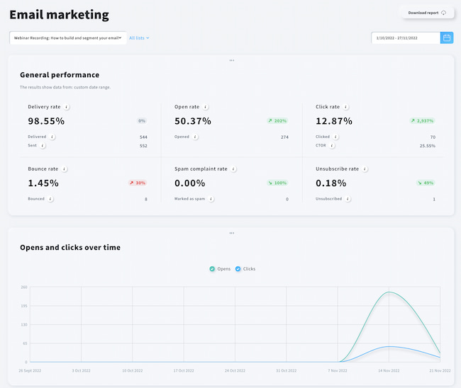
Email click rate tells you the percentage of your email recipients that clicked at least one link placed in your email. It is one of the essential performance metrics used in email marketing.
Many marketers think that the click rate is the most important metric as it measures the real engagement generated by their email marketing campaigns. And since spam filters developed by mailbox providers depend largely on the engagement rate to evaluate emails, it has a direct impact on your email deliverability.
Others, however, claim that the conversion rate is more important as it ties in directly with the revenue. And revenue generated by your email marketing program is what most email marketers report on.
Regardless of what you believe in, I think we can all agree that every solid email marketing strategy should lead to achieving high click rates and using click data to plan future email marketing campaigns.
Editor’s note: Some email marketers distinguish email click rates from email click-through rates. But since the difference between these terms is subtle, we chose to use them interchangeably.
Related:
1. How to increase your email open rates
2. Email marketing best practices and tips
3. Guide to email marketing KPIs and metrics
How to calculate the click rate?
To calculate the email click-through rate, you need to take the number of people that clicked on a link in your message, divide it by the number of people that received your email, and multiply that ratio by 100. The percentage will be your CTR.

For example, 1,000 people successfully receive your newsletter, and 100 of them click your CTA button. It means you need to divide 100 by 1000, which gives you 0.1. Multiplied by 100 will provide you with a 10% CTR.
CTR vs. TCTR vs. UCTR vs. CTOR
Yes, there are many acronyms here, but we need to be on the same page regarding those email metrics.
There are two basic types of click-through rates:
- TCTR – where T stands for Total
- UCTR – where U stands for Unique
As you can figure out, TCTR counts everything. The downside of this one is – it shows slightly bloated data. The statistics cover the same subscribers clicking multiple links or clicking the same link multiple times.
Whereas the UCTR (unique click-through rate) only shows the percentage of unique users. Whether John clicks from one or every single link placed in your email, it counts them all as one ‘click’.
OK, and what about the CTOR? Click to open rate is the moment of truth regarding how engaging your email content is. Here, you take the number of people that opened your email and check how many of them clicked through to your landing page.
Here’s the math behind it:
Open rate: 20%
CTR: 2%
CTOR = 2%/20% * 100% = 10%
What’s a good click-through rate?
According to the latest 2022 Email Marketing Benchmarks report, the average click-through rate was 2.02%.
So unlike open rates, most email campaigns observe single-digit click-through rates.
However, similarly to other email marketing metrics, your click-through rate will largely depend on multiple factors, including:
- Type of email you’re sending – e.g., the average CTR for newsletters was 2.51%, and for triggered emails, it was 5.31%
- Type of email campaign you’re sending – e.g., informational vs. sales oriented
- Your industry – e.g., the average CTR generated by Financial services was 4.29%
- Your location – e.g., the average CTR generated in Germany was 5.36%
Having said this, it’s natural to see higher click-through rates for more personalized campaigns like – welcome emails, abandoned cart emails, or cross-sell emails – and lower CTRs for more generic campaigns or email blasts.
So don’t beat yourself down if one of your campaigns doesn’t perform too well.
At the end of the day, it’s important to make sure your average click-through rate is at an acceptable level, usually around 1-2%.
Now that you know the essential theory, it’s time you learned how to ensure your email marketing campaigns consistently see high click-through rates.
13 actionable ways to improve your email click-through rates
One of the reasons behind a drop in email engagement is that most email campaigns boil down to salesy and promotional messages. Being in a constant rush often leads to shortcuts – such as skipping segmentation and sending a generic email blast to everyone in an email list. And that won’t positively impact your bottom line.
Speaking of segmentation, this is the first step to improving your email click-through rate.
1. Segment your email list
One-size-fits-all messaging can only lead to bumping your unsubscribe rates. Forty-year-old mompreneurs will have different buying habits than 20-year-old male students. A white-collar finance director will fancy a different tone of voice than a tattoo artist. And people who buy sustainable and eco-friendly products won’t be interested in the offering tailored for Harley Davidson enthusiasts.
Segmenting your audience is essential and should be your first step. Breaking down your email lists into segments will enable you to craft relevant and personalized email content and adjust your copywriting.
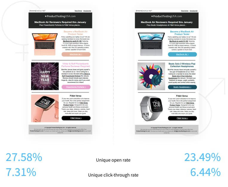
👉 Below, you can see an example of a targeted email campaign run by Submission Technology. This email campaign went out to two segments – men and women – and observed an average email click-through rate of 6.44% and 7.31%, respectively.
Follow our guide to learn more about effective email segmentation strategies for different types of businesses.
25 ways to build your contact list
We’ve compiled a list of 25 tried-and-tested tactics for the success of your future campaigns.
2. Personalize your email content
Once you define your segments, you can start working on personalizing your emails. But please be careful – many email marketers think injecting a recipient’s name in the subject line is enough. In reality, it’s not that simple. The truth is that people have become more resistant to emails such as “Don’t let this offer slip by you, [[firstname]].”
The good news is – personalized content in the email body still outperforms the regular one. Circling back to our Email Marketing Benchmarks report, emails with a personal touch score an average of 3.18% CTR, while the generic messages are left behind with a 2.40% click-through rate.

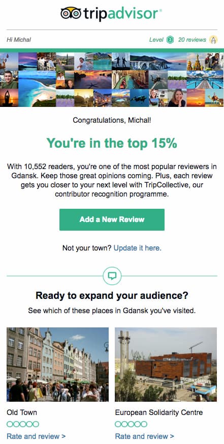
A good personalized email leverages users’ geo and demographic data, but a stellar one also utilizes users’ previous behavior. Here’s a model example of a personalized message by Tripadvisor, featuring information about subscribers’ past activity:
Follow our blog post to learn more about personalizing your emails, beyond the email subject line.
3. Energize your copywriting
Once you take care of segmentation and personalization, it’s time to look after the wording. How you handle your copy can make or break your open and click-through rates.
First, you need to entice people to open your message. That’s why those two elements will demand special attention:
- Email subject line
- Preheader
How you play with both will depend on your audience’s nature. Of course, you can experiment with FOMO, curiosity, being funny, and then monitor the results. But the real deal comes from your customer research – understanding the market and speaking your customers’ language is the best way.
Here are two good examples that show brands that understand their target audience – content marketers. While they both use completely different angles, they highlight activities or goals their audience wants to achieve:


Second, you need to double down on your email body copywriting. Again, how you speak to your customers will depend on who they are, but there are proven ways to structure your email content to drive more engagement.
One of the most popular copywriting concepts is AIDA which stands for:
- Attention – where your role is to create a hook that will glue your subscribers to their screens and keep them reading the email till the end.
- Interest – once you grab the attention, keep the promise and deliver a solution to their pain point.
- Desire – here, you can pitch the value of your product or offering and what benefits it delivers. Back it up with social proof, such as a testimonial or a snippet of data.
- And Action – this is where a clear and concise Call-to-Action comes into play.
How to Write Newsletters that Get Opened Read and Clicked
If you want to form better relationships and increase your conversions through newsletters, you will definitely want to get this guide!
4. Give your best shot in the CTA
Yes, the bottom line of every commercial email is the call to action. If your subject line nails it, it will drum up your open rates. If the email body is engaging, people will easily consume it. But if the CTA is generic, it can sabotage all your previous hard work.
First, it’s a matter of being a wordsmith here – just as with the subject line, you need to pick words that will take readers from – I don’t know, maybe? – to – Yes, I want it! – state.
Each time you sit down to craft your CTA, remember to:
- Use active verbs – “buy,” “register,” “book,” “save,” etc.
- create a sense of urgency – “now,” “today.”
- plug the benefit – “secure future,” “mental health,” “better results,” etc.
- consider injecting the reader’s perception – “Yes, count me in!”, “Start my free trial” “OK, I want this!”
As for the technical part, some experts advocate placing the CTA above the fold, while others claim it’s better to have it below the fold. Some say that you should place your CTA on the right side, and others will tell you to have it centered.
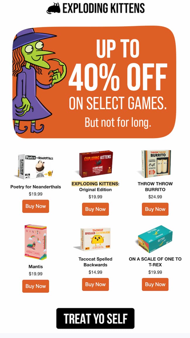
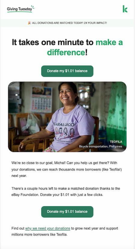
We encourage you to test and see what’s bringing the best results for your campaigns. Who knows, maybe your audience would convert better if you added a bit of humor or personalization, like in the following examples.
Learn how A/B testing your email campaigns can help you drive more clicks.
💡 Pro tip: If your email is particularly long, you may want to consider adding another CTA at the bottom of your message. This way, your subscribers won’t need to scroll back up if they’ve read through your email.
5. Figure out the best timing
What’s the best time to send my emails? – This is one of the most frequent questions I hear from our customers.
Is there a link between the email send times and higher click-through rates? According to our study, the CTR is stable enough during regular office hours, but it’s worth noticing that it has several spikes: at 4 AM, 6 AM, 9 AM, and 6 PM.
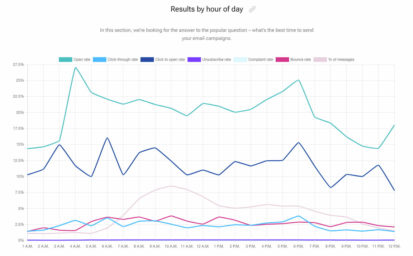
And what about the day of the week? The same data shows no clear winner regarding the best engagement. You might, however, stick to the Monday-to-Friday schedule because it tends to be more predictable.
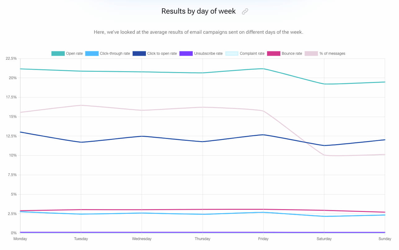
💡 Pro tip: If you don’t want to take chances here, you can use GetResponse’s Perfect Timing feature. It’ll automatically optimize the send-time of your email campaigns, taking into consideration your subscribers’ behavioral data. Our data suggest that emails sent with Perfect Timing see, on average, 3.09 percentage points higher click-through rates.
6. Maximize the engagement with triggered email campaigns
There is no doubt that email automation is on a roll. We’ve compared the results of different categories of emails – triggered emails, autoresponders, newsletters, or RSS messages. And while newsletters and average marketing emails still prove their worth in bringing results, triggered emails outrank them regarding open and click-through rates!
A triggered email is automatically released right after a user takes a specific action or meets certain conditions. It can be a welcome email sent out after subscribing to your newsletter, a confirmation email triggered by purchase, or a “don’t miss out!” message after your customer abandoned the cart.
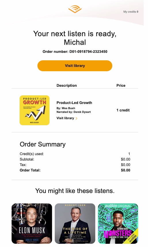
The beauty of marketing automation is that you can set up the rules on what kind of user behavior triggers sending specific types of content. And no, you don’t have to be an engineer to manage that!
Check out this beginner guide to marketing automation and start creating automated your first email workflows.
7. Spark a sense of urgency
Whether you run an online shop with physical goods, sell online courses, or offer consultancy services, sending email campaigns with time-limited offers has a huge winning potential. It works perfectly for Black Friday, Christmas, and Valentine’s Day deals, but not only in those cases.
If you have a webinar coming soon, send an invitation email to your subscribers with the bottom line, “hurry up, the number of seats is limited!” and the FOMO mechanism will work its magic.
The same rule will apply if you sell a series of training sessions usually priced at $3K, but available (“just for you!”) for $999, but only till tomorrow’s EOD!
Here’s an example of that kind of email:
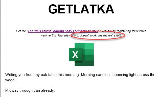
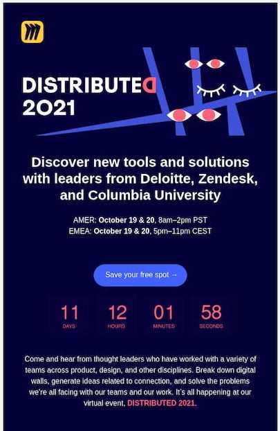
💡 Pro tip: To add some more sense of urgency, consider adding a countdown timer to your emails using tools like Sendtric, Mailtimers, or Countdownmail. This type of dynamic element can help you further improve your email click-through rates. Please note that due to Apple’s MPP changes, these tools may not work for all email clients.
8. Add more-engaging content
Here’s another way you can increase your click-through rates – use more-engaging content formats.
Think about what your target audience expects to see in your emails. Typically that’s text, images, and CTA buttons. Now, consider what could break that pattern and help you stand out more in the inbox (while making sure your message is still relevant.)
Some of the most engaging content formats include:
- Videos
- GIFs
- Surveys
- User-generated content
- Gamified/interactive elements
- Customer testimonials and reviews

Consider which of these formats would work well for your audience and run an A/B test. The chances are you won’t need to change up your offer but simply repackage it.
Pro tip: Find out how Selsey, an online store selling furniture and house decorations, manage to 2x their conversion rates by adding customer reviews and promo codes to their abandoned cart emails.
9. Adapt your email for mobile screens
Almost 50% of message clicks come from mobile devices. Our data confirm that, as a digital tribe, we use our smartphones nearly as often as laptops and other computers. People open and interact with their emails on their mobiles even if they’re at home, not to mention whenever they are outside.
So, optimizing all your messages for mobile devices is one of the fundamental ways to amplify the click-throughs.
To make sure you’re on the safe side, explore GetResponse’s predesigned email templates that are mobile-responsive, meaning they look good on any device:
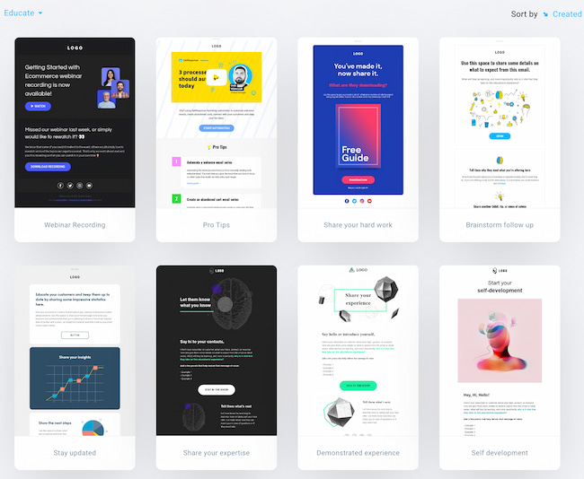
And if you prefer to design your emails on your own, check out our email design guide that explores the mobile email marketing topic in more detail.
10. Follow up
Sometimes, all you need to do to drive more email clicks is to follow up.
Perhaps your subscriber missed your email. Their inbox got flooded, or they were busy with other things. Or they weren’t ready to click through to your website and make a purchase because your message reached them while they were commuting. Whatever the case is, an extra attempt at reaching your audience can make a huge difference.
And you don’t necessarily need to follow up via email. You can set up an automated campaign that’ll follow up with your audience via email, SMS, or even web push notification.
By reaching them through a different marketing channel, you can easily remind your recipients of the offer and its expiration date – and increase both your open rate and click-through rates!
If you’d like to learn more about this highly-efficient way of setting up your marketing communication campaigns, check out our exclusive guide:

7 Connectable SMS Marketing Automation Ideas
Want to make more impact with your SMS campaigns? Take a look at these 7 SMS marketing automation campaign ideas and learn how to set them up all by yourself.
11. Add social media icons
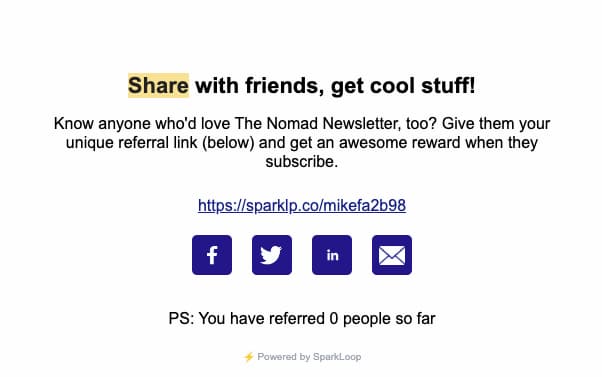
According to our Email Marketing Benchmarks, landing pages with social media icons are among those that succeed in higher conversions. Other studies also underline the meaning of having social sharing buttons in emails regarding higher CTRs.
When people reading their emails don’t find them helpful, they can always expand their reach and share your message with their network. And that can influence your email performance.
12. Clean your email list
Another way to improve your average email click-through rate is to clean up your email list.
While it may seem counterintuitive, removing contacts that notoriously ignore your email campaigns can have a positive impact on your overall email metrics, including your email deliverability and sender reputation.
Not only does this process help you deliver your emails better and increase your average click-through rates, but it also helps you make better business decisions and save costs on your newsletter software.
Follow our guide to learn more about email list cleaning best practices.
13. Nothing is set in stone – test your campaigns!
There are several aspects of your marketing emails that can translate into more opens, CTRs, and conversions, such as:
- From name
- Subject lines
- Preheaders
- Email content/copywriting
- Email design
- CTA
- Frequency
- Time and day of the week
- and more!
The above elements may perform differently for every industry, business type, and buyer persona. While writing a generic subject line in some cases will generate more engagement, in others, embedding emojis will drive better results. The same goes for CTA – one of your cohorts might fall in love with a super-creative copy, and the other would prefer something you weren’t even betting on.
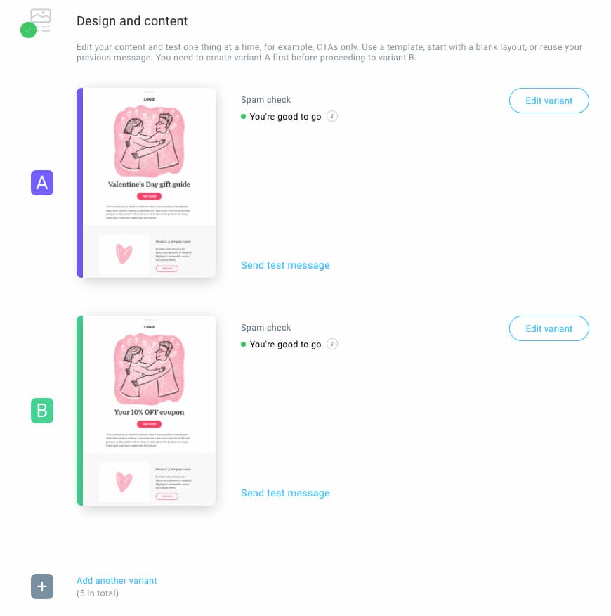
The good news is you can quickly eliminate all the guesswork from your email marketing experience. How? With A/B testing. Click here to learn how to set up your email A/B test in 9 easy steps!
Summing up
Email marketing can be a highly effective tool for businesses to connect and sell to their audience, and we’ve got plenty of case studies that prove that.
However, if you fail to achieve satisfying click-through rates, your efforts might go to waste, and you’ll get quickly discouraged.
Now that you’ve learned these 13 ways of boosting your email clicks, you’re fully equipped to start driving more engagement and higher ROI from your email campaigns.
So go ahead and launch your next email campaign with brand-new energy and confidence!
And if you’re looking for an email marketing platform that’ll empower your email marketing strategy, we’re here to help!
This article was originally written in 2016 by Pam Neely, and it’s been updated in 2023 by Michal Leszczynski.