It’s quite common to see event landing pages drawing a lot of traffic while the event itself sees poor attendance. This is not very surprising when you realize that most event landing pages usually do a poor job of communicating the value of the event.
Also, bear in mind that for some visitors, the landing page is probably their first contact with your brand as a whole. And you know what they say about first impressions?
Today’s article will cover what top brands are doing right with their landing pages for events. You’ll get enough inspiration to help you design the perfect landing page to increase your event ticket sales.
Let’s start by defining event landing pages.
What is an event landing page?
An event landing page is a standalone web page dedicated to promoting and providing necessary information about a particular event, whether physical or virtual. It’s where potential attendees see information, such as the dates, registration options, ticket types, agenda, and location.
There are two types of event landing pages:
First is the event registration landing page. Essentially, all this page does is engage visitors and encourage them to sign up for the event. That means buying a ticket for a paid event or simply reserving a spot for a free one:

The second type is the lead capture event landing page. Here, you only want to capture the information of potential attendees, such as their emails. You’ll then send them more information about the event down the road:

You can opt for any of the above landing pages, depending on your current goals.
Why is an event landing page important?
Your event promotions and ads need a landing page for various reasons.
For starters, a dedicated landing page will help you bring in more attendees than your website or a third-party listing.
Let’s say you place an event sign-up form on your main webpage. Potential attendees can easily get sidetracked by other things like your blog posts. This takes their attention away from the main reason they were there – event registration. Thankfully, an event landing page prevents this and gets you more conversions.
Conversions aside, a landing page also allows you to secure the emails of highly qualified leads. Remember, the event is related to what you offer in the first place. That means the people who are likely to register are precisely the ones who might be interested in your product at some point.
A landing page opens up an opportunity to acquire emails and nurture these leads through your sales funnel.
15 examples of effective event landing pages from leading brands
Before creating your event landing page, consider drawing inspiration from the following examples. These brands excel in structuring, creating content, and communicating the event proposition.
1. Event landing page example – Money 20/20 Asia

Your audience has a lot of events they can choose from. So how do you show them yours is the best? Follow this example from Money 20/20 and add trust-building indicators like recognizable brands to let visitors know you’re at the top of your field.
These references add credibility to your event and help it stand out from a sea of copycats. So go ahead and brag. Doing so will more than likely boost landing page conversions.
Key Takeaway: Choose your most important affiliation and prominently display it just below the form on your event registration page.
2. Event landing page example – MagentoLive

In this example, MagentoLive focuses on an action-oriented landing page UX design. Their site flow streamlines the visitor’s experience by offering them a variety of actions. If the prospect is not ready to register at first glance, they can take a few different actions.
For instance, a visitor can share the event on social or apply for a merchant discount if they fit the qualifications. Social sharing is an important addition to this registration landing page because potential attendees might be interested in seeing who in their network has plans to go.
Meanwhile, the opportunity to apply for a discount might encourage would-be attendees who face budget limitations.
Key Takeaway: Create multiple visitor experience tracks by optimizing your landing page flow to enable various user actions.
3. Event landing page example – Hashtag Sports
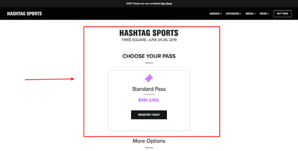
Spotlighting their Standard Pass is a great example of contact segmentation. Hashtag Sports gathered information from their event marketing software, carefully analyzed offers being made by their competition, and proved that they clearly understood their attendees and their ticketing preferences.
More options below the fold are targeted toward groups and industry insiders, but, likely, prospects won’t even need to scroll and find them. Instead, they’ll simply select this first option since it has been tailor-made for them.
Key Takeaway: Streamline your ticketing presentation by showing the most popular option first, keeping it free from the distractions created by other packages.
4. Event landing page example – The ABM Innovation Summit

The ABM Innovation Summit has a smart tactic for email list building: offer a coupon. After clicking the orange buttons on either the center of the page or the top right corner, site visitors are prompted to enter their email to reserve their generous coupon.
By signing up, they agree to be added to their notifications which could include newsletters, event reminders, and affiliate codes to expand their reach further. The possibilities are endless with this high-value offer and can be applied to any advanced reservation option.
Key Takeaway: Build your email list through reservation pages that allow prospects to receive something valuable in exchange for future communication with your brand.
5. Event landing page example – MozCon

This event registration landing page by Moz for their MozCon event is highly informative and helpful for prospects. Their value proposition is immediately addressed with categories like speakers, content, and network displayed towards the top.
Those curious about MozCon can learn, in mere seconds, that attending this event will help them gain exclusive educational opportunities from thought leaders, gain actionable insight into their industry, and meet some interesting people while they’re at it.
Key Takeaway: Showcase the value propositions of your event early at the top of your page. That way, your visitors can see and understand the value of the event at first glance.
6. Event landing page example – UXSG Conference
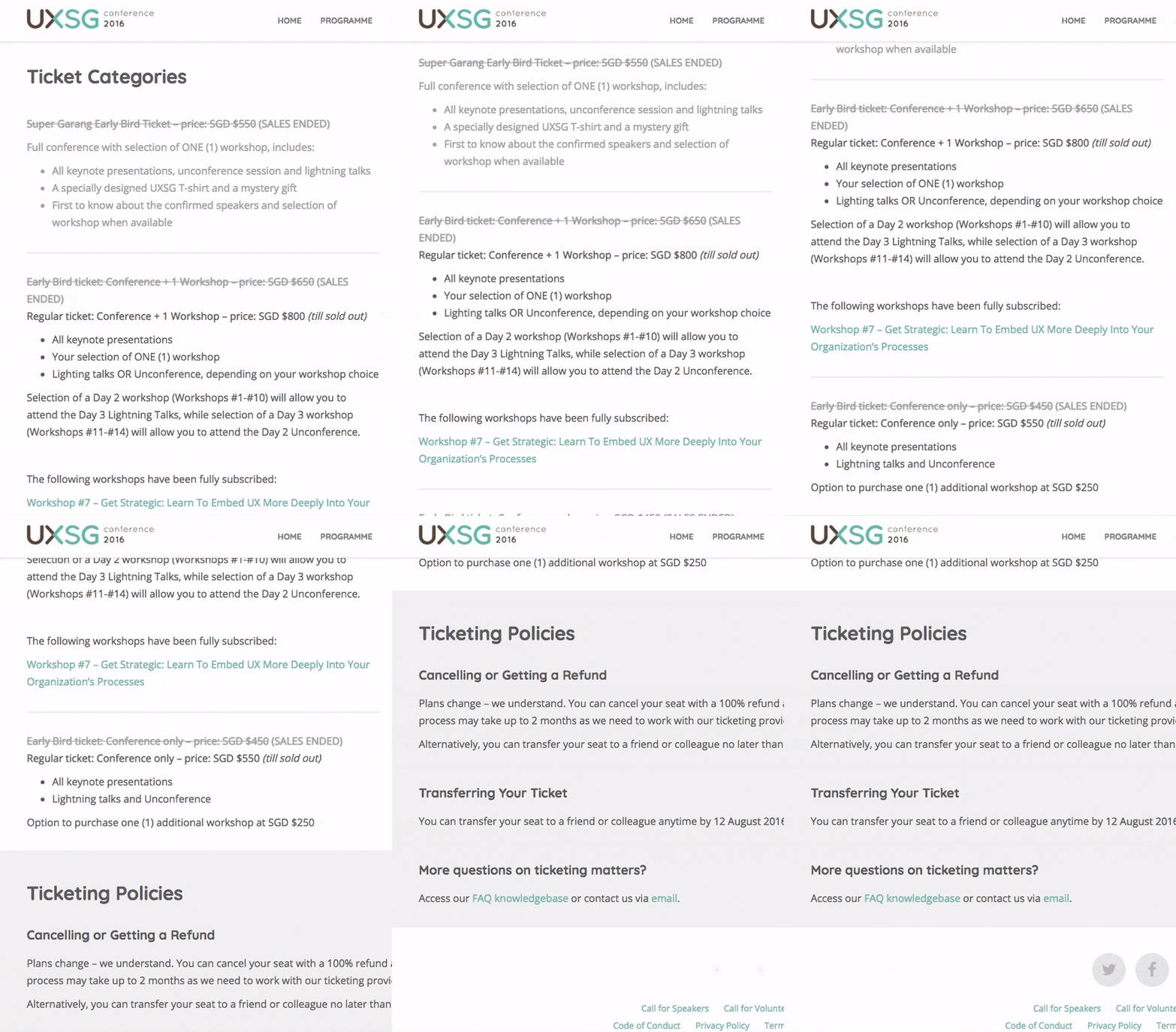
Limited-time ticketing offers put pressure on attendees already interested in attending your event to fully commit. Early bird, and super early bird ticketing (as you’ll see presented in this example from the UXSG Conference), help event planners gauge their ability to sell out from the get-go.
Their use of bullet point lists makes the offers easy to skim, which makes the decision-making process easy too.
Key Takeaway: Test out an early bird option with a full description on your landing page. Also, if you offer more than one early bird option, keep track of each package with the help of an event registration software or another analytics tool.
7. Event landing page example – Growth Acceleration Summit

This event registration landing page showcases the power of simplicity. By displaying a registration form with limited questions, the process becomes faster and easier for visitors. User-friendly features like this eliminate friction caused by lengthy questionnaires and unnecessary information that attendees might not be interested in sharing. Optimize your landing page for lead generation with this simple tactic.
This page also helps generate contacts for a future event, even though the final event website may not be done.
Key Takeaway: Registration forms should be short and to the point. Review yours and pare it down to the bare essentials. If the website for a future event is not yet live, gathering contacts from an existing, highly trafficked registration page may be worthwhile.
8. Event landing page example – Connect Central

Connect Central does a great job using one of the many critical elements of landing pages that convert; three-pronged pricing.
Three-pronged pricing is the addition of two extra pricing options that make the bait offer more attractive. The first ticketing option displayed should be the most basic package. The second is the advanced package. It’s more expensive than the basic, but it adds a lot more value and is, ultimately, the one you want visitors to choose.
Finally, your third-tier pricing should be your most expensive and include all possible bells and whistles. This more expensive option should interest them enough to get a bite but be priced in a way that’ll make them lean toward the second package instead.
Key Takeaway: Create a three-tiered pricing option for ticketing that entices future attendees to select the package you’d like them to choose.
Read more:
9. Event landing page example – The Future of Marketing by The Drum
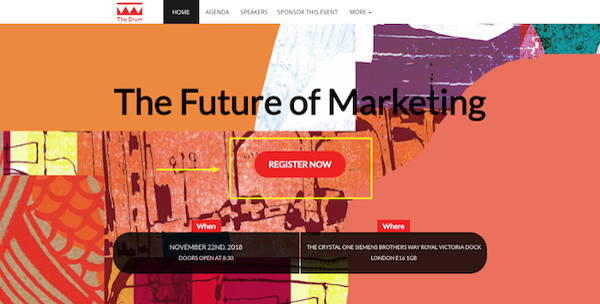
Sometimes it only takes one simple change to make a landing page convert. In this example, The Drum highlights the importance of finding your ideal CTA button placement. Try adding your registration CTA to the most visible spot on your webpage.
Use the surrounding design to guide your user’s eyes to it. Although it doesn’t appear in this instance, it can also help to make your button color stand out from the rest of your website.
Key Takeaway: Drive conversions and incentivize visitors to take immediate action by moving your CTA button to an obvious position on your page.
10. Event landing page example – Coachella

This event landing page does a great job of combining dynamic design elements with an informative copy. Using straightforward navigation, potential attendees can view the many policies and procedures necessary to participate in this multi-day concert and camping event.
Given its popularity, Coachella has to focus on simplifying what could otherwise be a highly complex experience, given the sheer volume of attendance and the details involved in the experience. They pulled it off without sacrificing the brand in the process.
Key Takeaway: Convert visitors without sacrificing vibrancy by fully displaying registration steps with summaries, descriptions, and all essential information.
11. Event landing page example – Running Remote Event Page
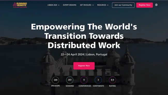
If you want potential attendees to click the “Register” button or spend their precious dollars, you must give them a reason to. That is, showing them your event is totally worth it.
Running Remote nails this by incorporating social proofs across every point of the landing page. They start strong with a video featuring testimonials, insights, and highlights of their past events. That builds up an initial excitement.
Scrolling down, you find a real-time count of event attendees who have signed up so far. Alongside this are testimonials and surveys showing how well people enjoyed the events and how they’ll be attending again.
Key Takeaway: Creating FOMO can help skyrocket your event attendance. Also, if you have a success story or anything fantastic to brag about, your landing page is the prime spot. Just remember to keep it genuine.
12. Event landing page example – South by SouthWest

Many of us dislike long-distance events because of the stress of finding accommodation.
No doubt, options like AirBnB have made things easier. But they still can’t beat the simplicity of registering for an event and, right below that, checking out accommodation options – all on one website. That’s why South by SouthWest’s landing page is pretty clever.
Key Takeaway: Team up with hotels close to your event venue. Promise to send your attendees their way in return for a bulk discount. It’s a win-win. Then, make it known on your event landing page that you’ve organized hassle-free accommodation for them.
13. Event landing page example – Artist Project Contemporary Art Fair

The Artist Project created this landing page to sell tickets for their 2020 contemporary art fair event.
One thing that really caught our attention was the fear of missing out (FOMO). They threw in a time-sensitive deal, promising a tempting 20% discount on ticket prices. Plus, they kept hammering the message – don’t let this exciting event slip through your fingers.
Key Takeaway: If you want more people to take action, offer a deal that’s hard to resist. Then, make it crystal clear that time is ticking.
14. Event landing page example – Confab

Unlike most examples so far, Confab includes a phone number in its landing page contact section. This allows visitors to contact the support team that handles the event directly.
Most people prefer speaking to a real person rather than clicking around a webpage or waiting hours for email responses. Providing this efficient, personalized touch can greatly impact your event’s overall success.
Key Takeaway: Add a phone number that interested attendees can use if they have any questions about the event.
15. Event landing page example – Marketing Exchange B2B

Remember the good old marketing rule – “When you speak to everyone, you speak to no one?” Well, it’s still golden.
In this example, B2B Marketing Exchange does a great job of speaking to one demographic: B2B marketers.
They also pulled another smart move by using the PAS (problem – agitation – solution) model for the copy:
- Identifying the problem – tight budgets for B2B marketers
- Agitating it – Getting results with leaner teams and budgets is a tough nut to crack.
- Then, viola – they presented the event as the solution.
Besides, the event is free. So, there are plenty of incentives pushing the visitors to get into action.
Key Takeaway: Keep your landing page laser-focused on one audience. Show that you know they have a problem and you have a solution they need.

9 Best Ways to Drive Traffic to Your Landing Pages
Want to learn how to drive traffic to your landing page and promote it effectively? In this guide, we’ll share 9 effective ways you can do it – even if you’re not an expert.
How to create a webinar landing page
Here are four best practices to help you create a landing page tailored for optimal conversions:
1. Define clear expectation
To begin, answer the question, “What exactly do I want to achieve with this landing page?”
Just like any event page, the goal of your webinar landing page could be any of these:
- Getting the email of potential attendees for now and message them later with more details. For instance, to later send the actual webinar invitation email.
- Or having them sign up directly for the event.
Pick one goal and run with it.
Your decision will determine the type of event landing page, event details, and CTA you’ll go for.
Take, for instance, you need an event registration landing page to fulfill the second goal above. That means you’ll use CTAs like “secure your spot,” “register now,” etc. You’ll also need to share details like time, location, and speakers, which might not be necessary for the first goal.
2. Build curiosity
Your landing page should spark your visitors’ curiosity and make them eager to sign up.
An attention-grabbing headline is the first way to achieve this. Promise something that piques your target audience’s interest or simply pose an intriguing question.
See how Sprout Social did this below. Imagine you, as a business owner, comes across a headline that says, “Grow your Revenue.” Your brain naturally goes, “Wait, I’m interested in that. What’s the secret? How can I grow my revenue?” That’s the kind of feeling you want to ignite.
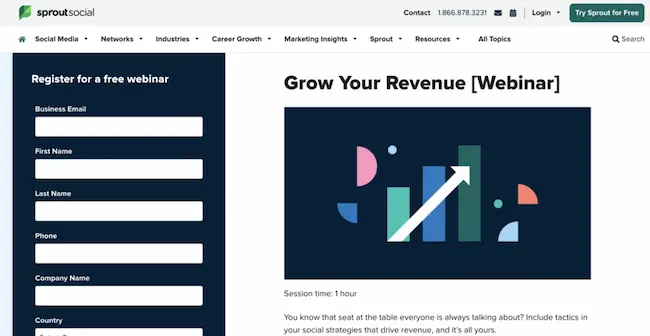
Source: Sprout Social
Next, you can share a video snippet from a past event, highlighting the exciting parts. This gives potential attendees a taste of the valuable content to expect, leaving them eager to know what’s to come this time.
Another clever move is featuring industry leaders and placing their details on the landing page. Your audiences are naturally curious to know what these experts want to share:

By the way, this beautiful landing page was created with our landing page creator. You can try it for free, too.
3. Focus on your target audience
Your webinar landing page should focus on a particular target audience. When the page directly addresses their interests, they’ll be more likely to engage with its content and eventually register for the webinar.
If your webinar targets multiple audiences, group them into segments. Say you have a marketing webinar. Your main segment might be business owners and marketers. You can use the lead capture event landing page to segment these two audiences.
Then, create a landing page for each segment and email each group sending them to the right landing page. That way, you can focus your proposition, structure, and content on the specific audience.
For business owners, you’d typically be talking ROI and cost-effectiveness, while for marketers, you can promise them innovative marketing strategies and the latest approach to analytics.
4. Easy RSVP process
You could have all the beautiful graphics on your page, but if your signup process is not streamlined, it’s unlikely to convert.
Be sure to keep your form fields simple. That means only asking visitors for essential details like name, email address, job title, and industry. The faster these people can fill out the form, the more likely they are to complete it:

Next, make your call to action clear and easy to spot. It’s best to stick to straightforward ones like “Register Now.” Also, you should have one CTA above the fold.
It’s equally important to follow up with the visitors to remind them of the event or send updates. To do this, you need their email addresses.
If you used Jotform to build your signup form, you can simply integrate it with GetResponse. GetResponse automatically pulls the email addresses of potential attendees. This allows you to send follow-up emails and nurture the relationship later on.
If you’re not sure how to write follow-up emails, let our event email templates guide you!
Improve your event landing pages today
Designing an event landing page that converts doesn’t have to be complicated. Just keep these main points in mind:
- Simple is always better. Bulleted lists, summaries, and marked steps improve the user experience and the registration process.
- Look at it with fresh eyes. Consider key elements like visitor flow and CTA placement from your visitor’s perspective when making design choices.
- Have a ticketing strategy. Whether you offer one ticketing option or three, super early bird or standard admission, make the choice obvious for attendees with smart pricing and clever displays.
Everyone knows that getting a high percentage of landing page conversions isn’t the easiest thing in the world. Luckily, there are many ways to adjust your event registration page and maximize its effectiveness. Tips from the above event landing pages will likely serve you now and well into your event planning future.
Author: Brandon Rafalson, Content Marketing Manager at Bizzabo
