An online portfolio is no doubt one of the best ways to showcase your work as a graphic designer.
Research shows that 81% of customers will conduct online research before making a purchase.
And since 46% of all Google searches are location-related, you can be sure that potential clients are using phrases like “graphic designer in [your location]” and “graphic designer near me” to find businesses like yours.
So, if you don’t have an online portfolio, you’re missing out on a lot of potential leads.
Whether you’re a freelancer or agency, an online portfolio helps you showcase your best work and explain your design business and process to potential clients.
If you’re looking for ideas, we’ve curated some of the great graphic design portfolios to get you started.
Did you know? With GetResponse’s Website Builder you can make a website of your own in minutes. It comes packed with a variety of ready-made website templates, intuitive UI, and uses artificial intelligence to help you build a website from scratch, automatically. Watch the video below to learn what you can achieve with this new website creator and start building a website for your portfolio today.
Here are 17 of the best graphic design portfolios we’ve seen
1. As the Crow Walks

Why’s this a good example to follow?
This minimalistic portfolio website showcases the work of As the Crow Walks, a cartography and design studio based in New York.
The homepage features a responsive image grid that highlights their most important projects which have been carefully selected to show their versatility. The website also loads fast and is super easy to navigate.
Key lesson from this example
- Mobile responsiveness is a must. Research shows that 74% of people are more likely to return to a site if it is optimized for mobile. Also, keep in mind that mobile accounts for approximately half of all online searches. So, ensuring that your website content is fully optimized for mobile devices is an excellent practice.
2. Eamonn Day Lavelle

Why’s this a good example to follow?
Eamonn Day Lavelle’s website is a simple yet impressive graphic designer portfolio. The homepage highlights only three important projects and each project is explained in detail on a separate page, with relevant screenshots and images.
The website also includes links to the designer’s Behance and Dribbble portfolios, for potential clients who might be interested in exploring more of his work.
Key lessons from this example
- A simple layout works. Research shows that the probability of conversion can drop by as much as 95% as the number of elements on a website increases.
- Don’t just list design projects on your website. Describe each project so potential clients can better understand your skills and how you can help them.
3. Twobirds

Why’s this a good example to follow?
These designers are not afraid to show off their impressive design skills. The website features an eye-catching visual design, with custom illustrations and icons that match the brand name.
The website also uses a lot of white space and bold typography, which makes the content aesthetically pleasing. Finally, there’s a clear call to action (CTA) so the website visitor is clear about the next steps to take.
Key lesson from this example
- Ensure your content is easy to read. Nielsen Norman Group found that users voted small font sizes and low contrast between text and background (which make content hard to read) as the top website mistakes people make.
4. Kate Moross

Why’s this a good example to follow?
Kate Moross’ website focuses on showcasing her design projects, which date back to 2006. She uses vibrant colors and minimalist designs to create a unique feel.
Since she has a massive portfolio, she groups her projects into relevant categories like portraits, hand-drawn typography, and geometric designs, for easy navigation. The website footer is also super simple and includes only copyright information and links to her social media pages.
Key lesson from this example
- If you want to show lots of portfolio content, categorize your work so website visitors can easily find what they are looking for.
5. Logo Design NYC

Why’s this a good example to follow?
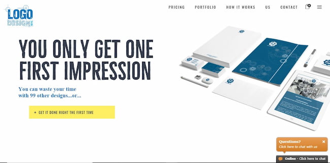
This website doubles as a portfolio and marketing website for the New York-based creative digital agency, Logo Design NYC. The portfolio page features mockups and images of their impressive logo design work grouped by industry and logo style.
They clearly explain their design process and even include a price list of available packages. They also include lots of testimonials from their Google My Business page and the website has a live chat that allows website visitors to get support right away.
Key lessons from this example
- Use testimonials for social proof. Research shows that 79% of consumers trust online reviews as much as personal recommendations from friends.
- Keep conversion in mind when designing your website. While you want customers to admire your collection of work, be sure to include elements that help you grab those sales. For example, using live chat software can boost conversion by up to 20% according to Invesp.
6. Tobias Van Schneider

Why’s this a good example to follow?
Tobias van Schneider specializes in product design and brand identity. His website features bold fonts, smooth scrolling effects, and highlights of his best work.
For social proof, he namedrops previous clients, such as Google, NASA, and Spotify. Tobias also uses his email newsletter to grow an audience for his podcasts, mixtapes, and other products — he already has 30,000 subscribers.
Key lessons from this example
- Include names of recognizable clients in your industry for social proof.
- Use an email sign-up form to grow your email list and build a following, especially if you have other interests.
7. Hugo Bazin

Why’s this a good example to follow?
Hugo Bazin’s website is a great example of a personal website. The website showcases his skills and work as a product designer in a charming and fun way.
He uses lots of emojis, transitions, and smooth scrolling effects. He also includes links to his social media pages as well as a downloadable PDF resume.
Even more, he presents his major projects as case studies that highlight the client’s problem and Hugo’s solution.
Key lessons from this example
- Case studies are super helpful for highlighting important workpieces. Between 71% and 77% of B2B buyers cite testimonials and case studies as the most influential type of content.
- Use emojis to show off your goofy side. And if you’re wondering if emojis work well in a business context, Intercom found that business messages that contain an emoji are four times more likely to get a response.
8. Ellen Skye Riley

Why’s this a good example to follow?
Ellen Skye Riley’s website features a minimalistic website design with a full-screen cartoon of the designer in the hero section, creating an immersive experience.
She presents her design projects in an even image grid and briefly explains each project on a separate page. The footer section prominently displays her contact information — email and social media pages.
Key lesson from this example
- Keep things simple. An overcrowded website is a huge turnoff for website visitors — 34.6% will leave your website because of poor content structure.
9. Anthony Burrill

Why’s this a good example to follow?
This simple and easy-to-navigate website features a thoroughly immersive design with lots of full-screen high-quality photos. The website also uses vibrant colors and bold typography, which makes it a delight to explore.
He also features a selection of design projects on the homepage; clicking on each project launches a project page where the site visitor can find more details.
Key lesson from this example
- Use high-quality images in your portfolio. 67% of consumers consider the quality of a product image as “very important” when selecting and purchasing a product or service.
10. Gino Piagesti

Why’s this a good example to follow?
Gino Piagesti’s website has all the right details. There’s a beautiful grid portfolio section that contains high-quality mockups of previous designs, such as logos, business cards, catalogs, and more.
The website also features customer reviews, clear calls to action, live chat, and contact information that’s prominently displayed in the header and footer.
Key lesson from this example
- Display your contact information in the right places. Research shows that a lack of thorough contact information will reduce the credibility of your business in the eyes of website visitors and cause them to leave your website.
11. Haley Mistler

Why’s this a good example to follow?
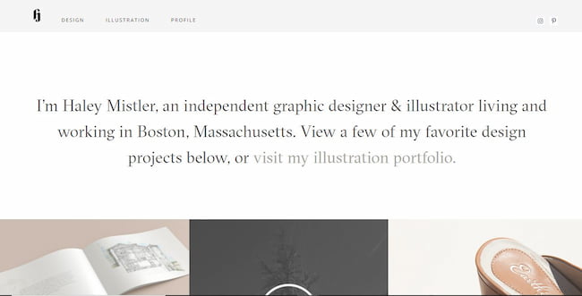
Haley Mistler’s website is a great example of a minimalist portfolio website done right. The homepage only has three sections — a brief intro, image gallery, and contact information.
There are also only three items in the navigation menu — design, illustration, and profile. At a glance, website visitors can find all the information they need about Haley’s work and how to contact her.
Key lesson from this example
- Use clear navigation to increase your website usability. GoodFirms identified bad navigation as one of the top three reasons why website visitors abandon a website.
12. Glick Creative

Why’s this a good example to follow?
If you’re a freelancer, then Doug Glick’s website is a good place to look for ideas. The simple one-page website has an interesting hero section that shows off his impressive design skills.
Glick’s fun personality shines through in his website copy where he shares details about himself, his work, and design process. A collection of samples open up in a lightbox, making it easy for website visitors to quickly view his portfolio.
Key lessons from this example
- A one-page website works well for personal and portfolio websites. If you need inspiration, check out these 25 one-page website examples.
- Copywriting is important for connecting with and engaging your website visitors. Apply proven copywriting principles to help you boost conversions.
13. Ben Drury

Why’s this a good example to follow?
Ben Drury focuses on design and art direction. He displays his work in a reel-like section with a horizontal scroll.
Since the design is unconventional, he uses arrows to guide website visitors in the right direction. The horizontal scroll design is also consistent on all pages of the website.
Key lessons from this example
- Use visual cues like arrows to help users navigate your website. A study found that arrows and lines are most helpful for driving users’ attention.
- Don’t be afraid to experiment with unconventional layouts. However, ensure that the layout is consistent across your website so users can easily navigate once they familiarize themselves with the layout.
14. Trevor Gessay

Why’s this a good example to follow?
Freelance art director Trevor Gassy’s website is another great example of minimalist portfolio website design.
The homepage features only a single line of copy and a responsive image grid of selected projects. The about page highlights his expertise, brands he’s worked with, and contact information.
When a user clicks on a project thumbnail, it launches a detailed project page where Gassy explains the process and skills behind the project. Each single project page has a footer menu that allows website visitors to easily navigate to other projects in the category.
Key lesson from this example
- If you’re taking a minimalist approach, be sure to include enough information and visual elements to make it easy for website visitors to navigate your website.
15. Dennis Bolt

Why’s this a good example to follow?
Award-winning freelance designer, Dennis Bolt, uses simple circular rows to highlight all the important pages of his website on the homepage.
The title of each row appears on hover, so it’s easy for a website visitor to get a full overview of the website without clicking on any button — like an at-a-glance sitemap. He also includes a clear contact call to action on all the pages of the website.
Key lesson from this example
- Your website layout matters. Research has shown that 38% of website visitors will stop engaging with your website if they find the layout unattractive. That’s almost 4 in 10 visitors. So, think through your website layout carefully and find one that provides the best experience for your visitors.
16. Mango Media

Why’s this a good example to follow?
Alex Mango is an award-winning web designer who also offers graphic and motion design. His website is a good example of how to present your content when you offer more than one primary service.
On the homepage, the portfolio is grouped into three sections that are based on the three primary services he offers — web design, graphic design, and creative coding. The website also uses custom animations to increase interactivity.
Key lesson from this example
- The importance of beautiful design and layout cannot be overstated. A Stanford University research showed that users judge a website’s credibility based on its design look and pay the most attention to superficial elements.
- Web animations can help to improve user engagement. Viget found that colorful and branded animations were intriguing to users. In fact, users were willing to wait slightly longer on pages with branded versus generic animations.
17. Studio Rayn

Why’s this a good example to follow?
This dark-themed website includes all the right features — beautiful, high-quality mockups of completed projects, client logos for social proof, and contact information.
The designer, Rayna, also includes a clear description of her services, client testimonials, and a newsletter sign-up form.
Key lesson from this example
- Conventional designs work. According to Jakob’s law of internet user experience, users prefer your site to work the same way as all the other sites they visit. So, using conventional design patterns that users are already familiar with is a great design practice.
Related posts:
17 Photography Portfolio Examples You Should See Today
10 Mistakes to Avoid When Creating a Photography Website.
Top 19 Fitness Websites and How to Make Yours
How to Create a Simple and Effective About Us and About Me Page
21 Restaurant Website Design Ideas and Examples
How to make your graphic design portfolio website with an AI website builder
Ready to build your own portfolio website? GetResponse website builder has all the tools you need to build a great graphic design portfolio.
The AI-driven website builder works best when you provide important information about your business. This allows the builder to suggest custom features and design elements based on your business type and the website you want to build.
To get started, create an account with GetResponse or launch the AI website builder.
Step 1: Select your business category and website type
Once you launch the builder, select the business category that best describes your business.

Next, select the type of website you want to create. In this case, we want to create a portfolio website.

Step 2: Select the features you’d like to have on your website
Based on your choices in the first step, the builder will recommend important website features, such as a gallery, testimonials, sign-up forms, and more. Select as many features as you need.

Step 3: Choose your website colors and fonts
In this step, you can select appropriate colors and fonts. You can pick from the themes suggested by the builder, extract colors from your logo, or import styles from an existing website.

Once you’ve made your selections, allow the wizard to generate sample templates that you can start customizing right away.
Step 4: Select a design template

Preview the suggested designs and pick one that best matches your style preferences. You can fully customize this later.
Step 5: Sign up for a GetResponse account

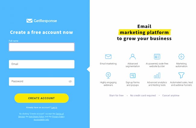
To fully customize your design, you’ll need to sign up for a GetResponse account. Simply provide your name, email and choose a password. Follow the prompts to verify your email address and activate your account.
GetResponse’s Website Builder lets you build your website at no time! It packs all the features you’ll need to start building your online presence and even includes essential email marketing tools that’ll help you communicate with your audience.
It also gives you limited-time access to premium features, such as marketing automation, webinars, chats, web push notifications, or paid ads. So when you think you’re ready to scale your business beyond your website and email, all you need to do is pick one of our paid plans.
Step 7: Customize your website
Once your account is set up, you can customize your website as much as you please.

You can add new sections, design elements, or completely change the colors and fonts. The website builder is fully responsive and you can preview what your website will look like on desktop and mobile devices. You can even choose elements to hide on mobile devices.

Step 7: Connect your domain
Once you’re satisfied with your website’s design, choose a name for your website and connect a domain name to make it live. You can use a GetResponse domain, connect a domain you already own, or buy a new domain name.

If you choose a GetResponse domain, then you can publish your website right away.
Conclusion
Building your portfolio website is the first step towards creating an impressive online presence. When building your website, highlight your best design projects and include features that will make your site easy to use and navigate.
GetResponse website builder offers all the tools you need to build a responsive and fully functional website in a few minutes. By providing details about your business, the AI builder can generate customizable website templates so you can work faster and confidently. So what are you waiting for? Go on and build your site!
