I’m excited to share the latest improvement to the GetResponse landing pages that will help you get more conversions by creating a sense of urgency.
Sounds interesting? Then read on to learn more about the countdown timer and why you should start using it to let your prospects know how much time they have until your offer expires.
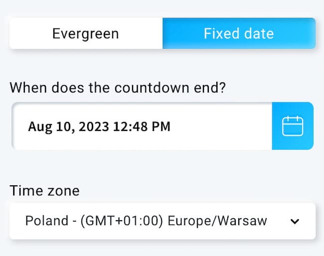
Editor’s note: We’ve recently updated the countdown timer element. From now on, you have two options: a timer that counts down to a specific date and time (e.g. time left till Black Friday), or an evergreen timer that counts down from the moment a visitor enters your page.
We know that the average attention span of a visitor is now down to 8 seconds. That’s why you should design each of your landing pages to capture as much attention as possible.
Today, online marketers use countless persuasive tactics based on human psychology to claim the attention of their visitors and convert them into customers.
Scarcity
I’m sure you’ve seen the phrase “limited availability” used by many businesses. That’s because when something’s running out people tend to think it’s more valuable. In other words, the value of a product can dramatically increase if the quantity’s limited.
Booking.com are masters of using scarcity to influence buying decisions. Just go ahead and search for a hotel room – and see the results for yourself.

Loss aversion
People naturally tend to avoid losing things. Especially if those are the things they’re attached to or want to have. Marketers use this sometimes and present their offers not as something you could gain, but rather as something you could lose forever if you don’t act immediately.

Countdown
A clock is the symbol of the passing of time. Besides being used in its usual context (e.g. sports games), countdown timers can be super useful to create a sense of urgency, which in the end can bring more conversions and revenue. In fact, research shows that a landing page countdown timer indicating urgency and scarcity can increase sales by up to 30%.
That’s why all the major ecommerce businesses use them often to boost their revenue, especially during the sales season.

Now it’s time for you to add this powerful tool to your arsenal and bring in more conversions for your business.
How countdown timers work in landing pages
Just drag and drop the timer icon from the toolbar on the right to start.

When clicking on the timer, you should see two options:
The fixed date countdown timer lets you select a specific date when you want the countdown to end.
To use this option you need to specify the date we should be counting down to and the appropriate time zone.

And the evergreen timer (often called a recurring countdown timer) which counts down the time from the moment your visitor enters the page.
To use it, you’ll need to specify the amount of time we should display and count down from. Plus, you can choose what’s going to happen after the count down ends – whether you want the visitors to stay on the page or redirect visitors to another page.

Once you’re done editing it, just click “save”.
Make sure you choose the right spot for your countdown timer so people can see it right after they land on your page.
You can customize the countdown timer design too! Just double click on the blocks within the countdown widget to change the color, or click on the numbers to format the text or change the font.
You can also customize the labels under the timer blocks. As an example, you can translate the labels to your own language.
How to use countdown timers for your business
One-time offers
Do you have a one-time offer that’s only available within a specific timeframe? Then countdown timers could be the perfect way to convince your visitors to buy.
You can use them to promote your ebook or an online course, a seasonal sale, or a discount on your B2B services.
Place them somewhere close to the headline. Have a look at the example below.

Webinar invitation pages
Webinars can also benefit from this useful tool – as they’re all set to happen at a specified time. Simply add the countdown timer to your landing page and set it up in a way that the timer expires at the start of your upcoming event.
This will not only create urgency and increase your signup rates, but will also help your registrants in remembering the date and time of your webinar.

Want to learn how to build high-converting landing pages and grow your business faster? Sign up for our free Essential Landing Page Course today.
Event promotion
You can also add countdown timers to event registration pages. Event organizers often use countdown timers to promote early-bird tickets and other ticket price reductions.
Have a look at the example below to see how you can use countdown timers on your event promo page.

Finally, if you haven’t used a countdown timer before and want to know how it would perform, you can run an A/B test and add a timer to your variation. I’m almost sure you won’t be surprised by the results you’ll get.
So, go ahead and use countdown timers to squeeze more conversions out of your landing pages.
And if you’re looking for inspiration for other landing page elements, check out these landing page design trends.
More from GetResponse blog:
