We’re. So. Excited.
The new Email Creator is ready for your test drive!
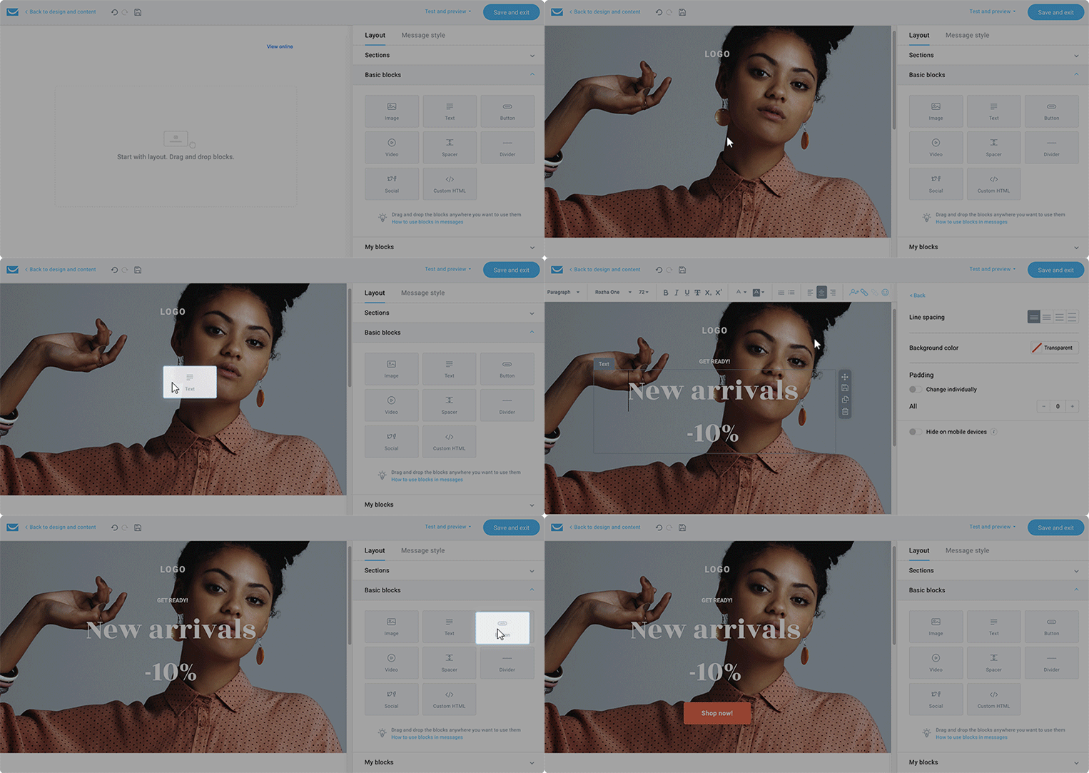
For the last few years, you’ve been voicing your opinions and experiences about our email builder. And we’ve listened.
Our newsletter creator has gone through a massive transformation to help you send beautiful, engaging emails – faster and easier than ever. What’s new? Basically… everything!
Update: The Email Creator is now available for newsletters, autoresponders, and marketing automation messages. We’ll be soon adding this feature also for the GetResponse Conversion Funnels & RSS Emails.
If you want to see how to use the new creator’s features to build beautiful emails, go ahead and watch our quick video tutorial at the bottom of this post.
Stunning emails on any device
The new creator is all about convenience and beautiful emails. It helps you create responsive designs in no time. You’ll see how easy and quick preparing your campaigns will become.
Not a designer? Don’t worry, powered with GetResponse Email Creator and our email design guide, you’ll be building beautiful emails in no time.
Fully customizable layout
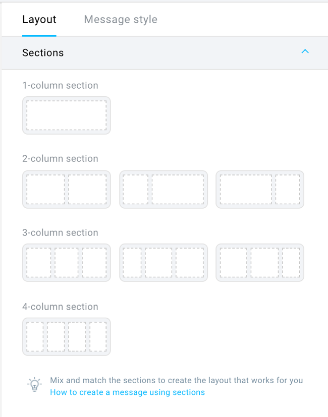
With ‘sections’, you can structure your designs easily and quickly. Simply drag and drop the customizable section layouts and fill them with your desired blocks.
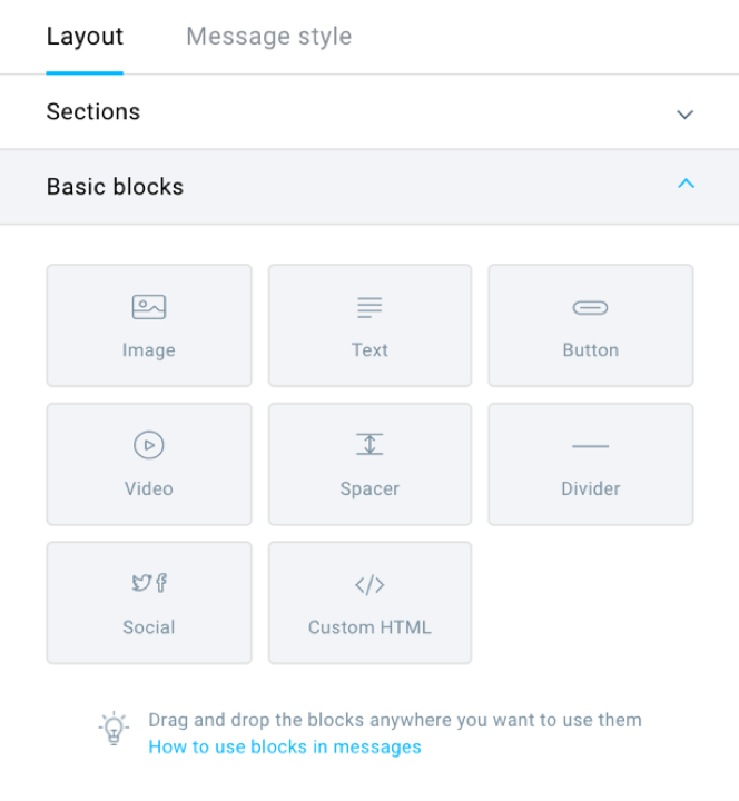
There are some basic blocks you can choose from, including ‘image’, ‘text’, ‘spacer’, ‘button’, etc. – all of them are customizable. You can easily add a video block and a custom HTML block.
Power of social sharing
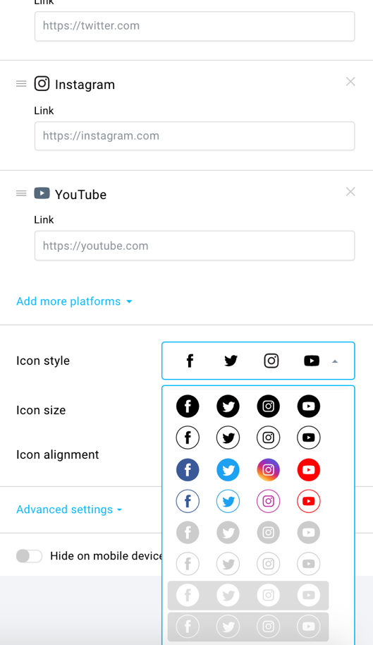
There is also a new, improved ‘social media’ block with predefined sets of both follow and share buttons that will make the icons look all neat and pretty in your email.
You can choose the platforms you want to feature, and change their order. Customize their style, size, and alignment. With the ‘follow’ icon set, you can provide all your social links, so that people can find your profiles on different platforms. The ‘share’ buttons allow your subscribers to share the email on social media. You can label these buttons with your own CTA’s, or just opt for ‘Share’, ‘Pin it!’ or ‘Tweet’.
This brings us to…
Saving your blocks
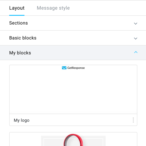
Each section you design will now have the option to be saved as a custom block in ‘My Blocks’. They’ll be available for you to use whenever you need them.
This will come in handy if you use the same (or similar) sections in your emails frequently. You won’t have to create them all over again every time. Now you’ll be able to simply open ‘My Blocks’, drag & drop the section you wish to reuse, and voila!
You can see all the blocks you’ve created with their previews. If you save a lot of them – don’t worry – there’s a search engine to search the blocks by name.
Saving and reusing blocks will help you with keeping your designs consistent. Also, it will leave you more time to focus your creativity on new parts of the email or its copy.
Google fonts functionality
If you fear that your audience will get tired of your Times New Roman emails, or that your font is overused and starts resembling Comic Sans – fear not. The new creator has comprehensive selection of fonts and full access to all Google Fonts. (Also, when you choose a Web Font you can also choose a fallback font in case your subscriber’s inbox doesn’t support web fonts.)
Cool, right?
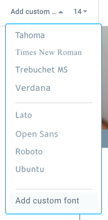
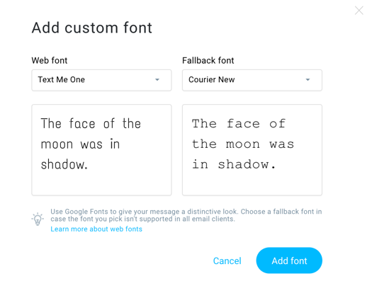
More freedom in your font choice means more on-brand, fresh, and stylish newsletters from you.
Hide on mobile
Your email will have a responsive design, which means it will look great on any device.
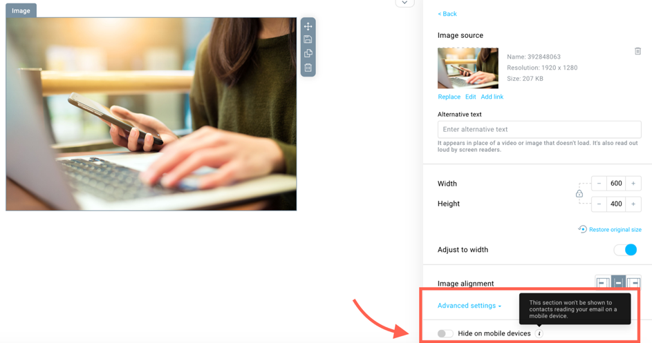
But we all know that, sometimes, making an email look as fabulous on mobile as it does on desktop (while keeping all its elements intact) is nearly impossible. There are things you want to cut out of the mobile version to make it simpler and more clean-cut. There are also things you reeeaaally wish the people viewing your email on desktop could see. Well, there’s never been an easier way to do that.
Choose the section or any individual element you want to hide on mobile and check this box:
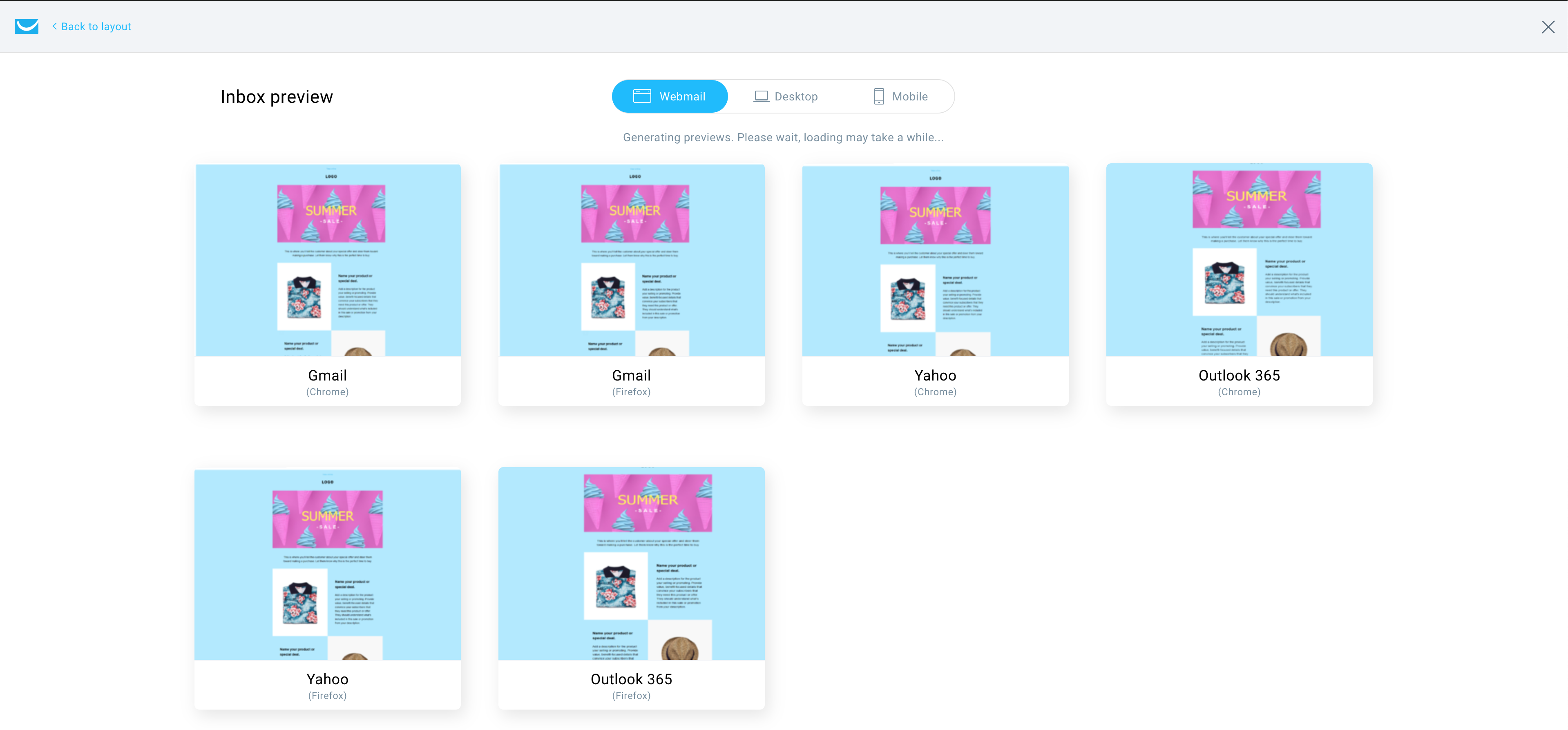
Inbox preview
You can test the created message as it will be displayed on various devices before sending the email to your subscribers. This will especially come in handy when you hide multiple blocks on mobile devices.
Currently, you can preview your design on:
• iPad6
• iPhoneX
• iPhone8
• Huawei P20 Lite
• Samsung S10
• Outlook 2016
• Outlook 2019
• Apple Mail
• Gmail Chrome
• Outlook 365 Chrome
• YahooBusiness Chrome
• Gmail FireFox
• Outlook365 FireFox
• YahooBusiness FireFox
A powerful photo editor
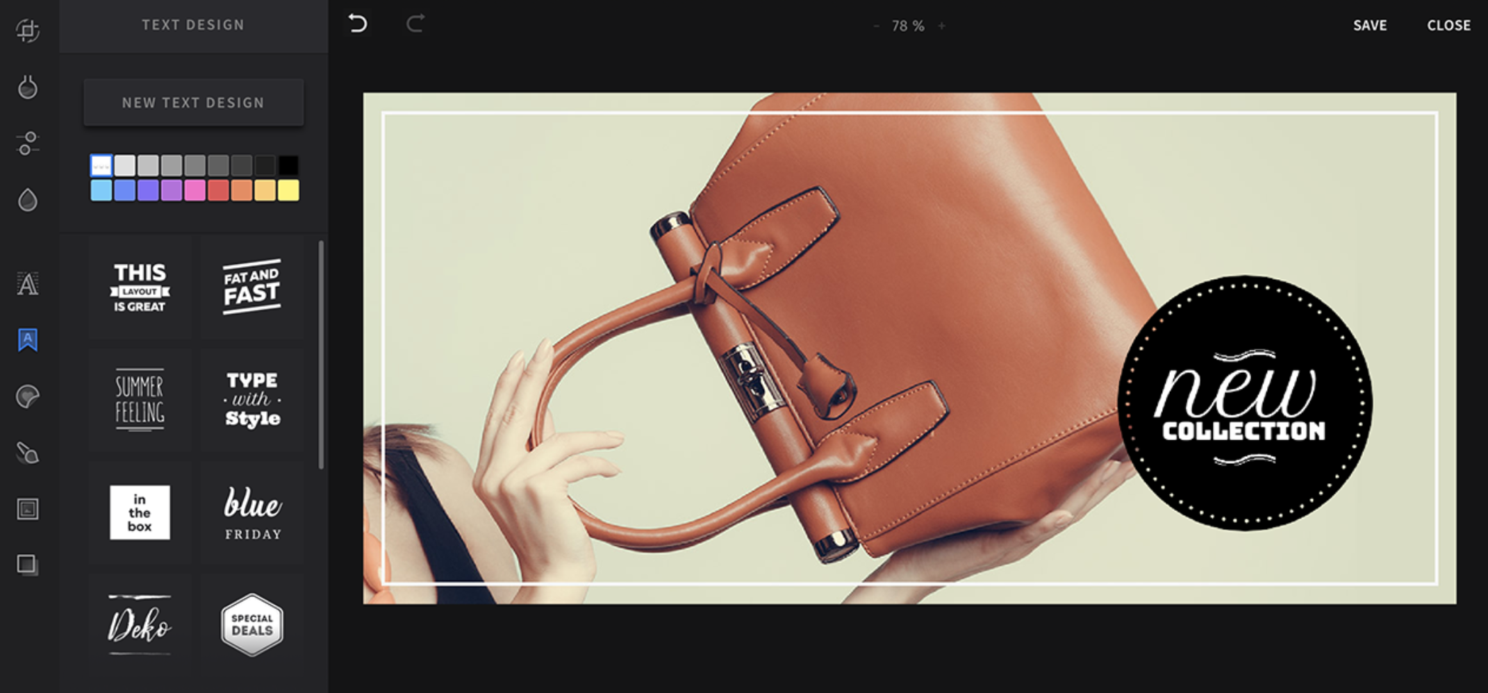
If, in the middle of designing a newsletter, you decide that any picture you chose for it isn’t exactly as perfect as you imagined – the colors are off, the cropping is wonky, the contrast is too weak – you don’t have to resort to expensive software or bother to search for apps that will help you edit it. The new email creator gives you all the options you need to bring your graphics to perfection.
Also, you have 5,000 free Shutterstock images to choose from and then edit them, too.
With stickers and cool text overlays you can create and personalize offer banners in no time.
Filters? Check.
Cropping, rotating, proportions changing? Check.
Contrast changing? Check.
Focus settings? Check.
Color settings? Check.
Stickers? Check.
Emojis? Check.
Symbols? Check.
Text design? Check.
All the essential editing tools and more!
More convenient and integrated
A new place for your templates
We admit it. The path you needed to go through to access your templates in the current email creator is… not ideal. It requires a bit of patience and one-too-many clicks. But we’re all in this together. So, while building the new creator, we made sure to make this process much easier.
Now, you can get to the templates you’ve designed with the new creator here:

(In the future, it will be a source of content for all message types.)
You can manage and edit them easily. And, create new ones, preferably using pre-saved blocks we mentioned earlier, to save even more time and effort – time is money, after all.
The ‘Create a message’ page
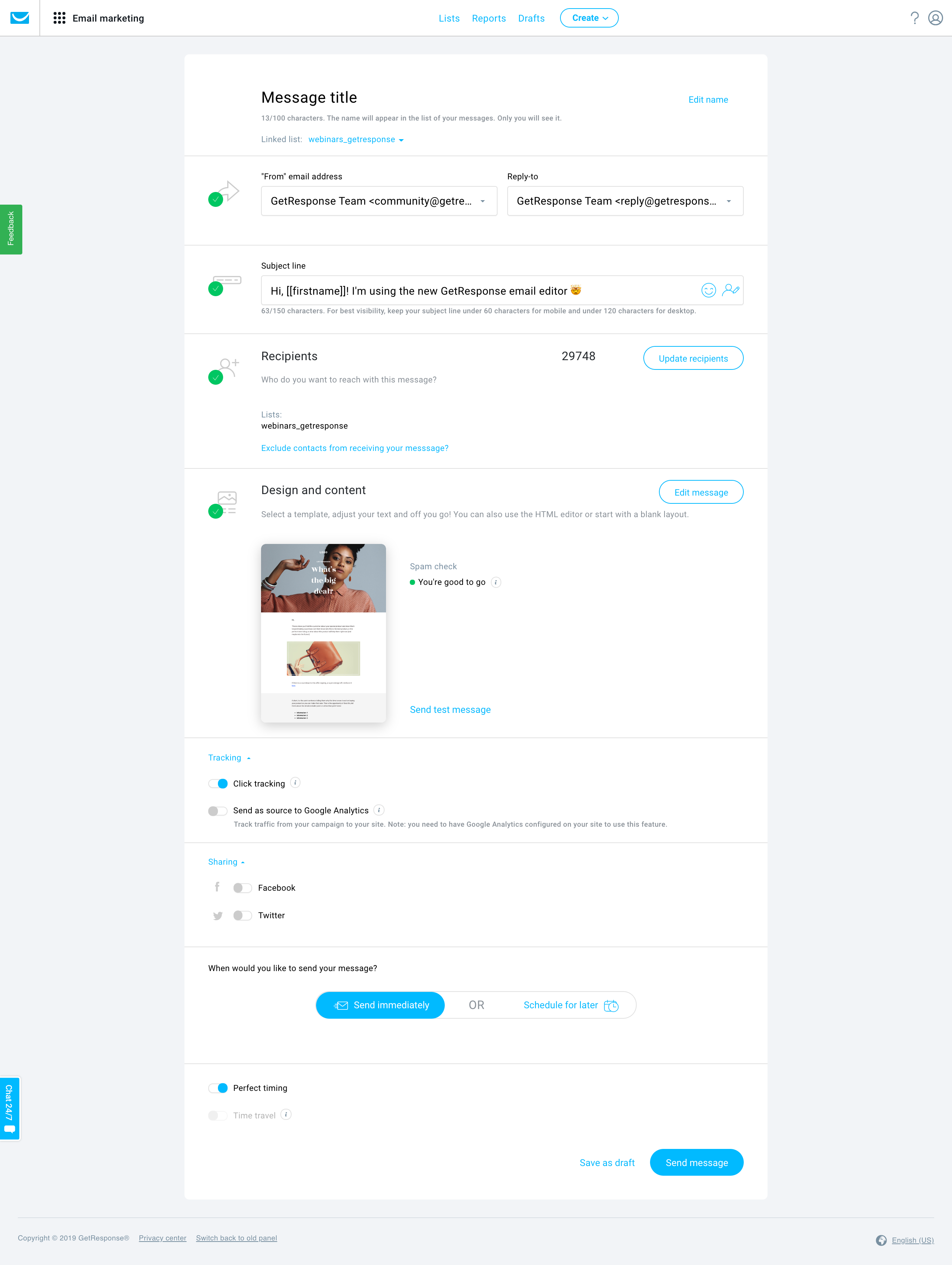
Everything you need to send your message is at hand. You’ll be able to manage all the settings, change the subject line and recipients, view your design, and send your message – all in one place. Let’s check it out:
From top to bottom:
There’s your message’s name – the one you see on the list, but your recipients don’t. You can edit it here. Also, there’s the list the email is linked to.
Then, the ‘from’ email address, and the ‘reply email’.
Next, the subject line field, with a bonus: FULL emoji support!
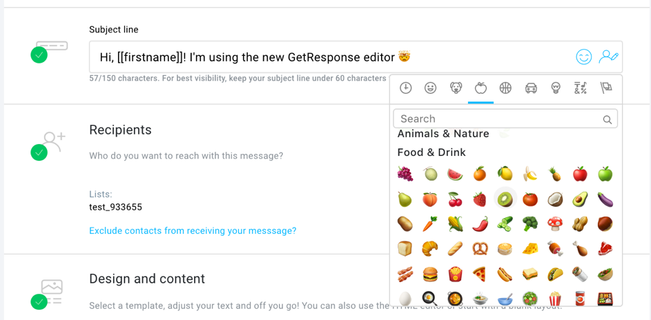
Recipients: all the lists and segments you want to send the message to. You can add/exclude them from here and see how many inboxes your email will reach.
Design and content: there, you see a preview of your email. You can choose to edit the message, and if you’ve made sure it looks amazing, send a test message to an address of your choosing.
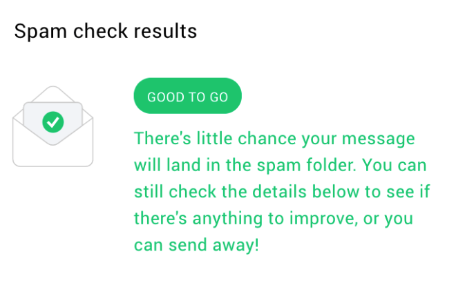
The spam check also went through a ‘glow up’. Inboxes want to know you’re not a bot – so why should the spam check talk to you as you’re one? Now, the spam check communicates with you in human language.
So, if it says that you’re good to go – you’re good to go. No more deciphering numbers and jargon.
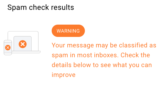
If there’s an orange warning, you can still send it. But, there’s a chance your email will be classified as spam. Luckily, there are detailed instructions for what can be changed in your message. You can read the suggestions in the spam check view within the creator.
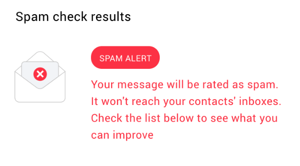
If it’s red, it’s a spam alert. You won’t be able to send the message, unless you make necessary changes suggested by the spam check.
The good thing is, with the all-new spam check system, it is much harder to be classified as spam.
Well, back to the ‘create a message’ page!
There are the tracking options – choose if you want the click-through rate to be tracked (to estimate the engagement) and the data sent to Google Analytics.
Want to share the message on Facebook/Twitter? You can do it from here, too.
Now, choose if you want the message to be sent immediately or schedule it for later. Do you want it to be delivered to your audience at a time they’re most likely to be checking their inbox? Cool. Choose ‘perfect timing’. If you want it to pop up at a certain time, regardless of their time zone, check ‘time travel’ then.
After going through all these options, you can save your newsletter as a draft or send the message.
Lights… Camera… Action! Your newsletter is in good hands. Go ahead and relax – enjoy all the time you’ve saved using the newer, faster creator.
Easy integrations
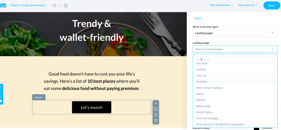
Your newsletters are integrated with your other creations in GetResponse. For example, if you want a button in the email to go to a specific landing page you created earlier, specify the link type as ‘Landing Page’ and choose the name of said page from the drop-down menu. That’s it! Easy, right? It works for webinars, too!
How to use the GetResponse Email Creator
Want to see the GetResponse Email Creator in action? Check out this quick tutorial or watch our full playlist on YouTube.
How to build beautiful emails with the GetResponse Email Creator
Create awesome emails today
Are you as excited as we are about the fresh and improved email creator?
That’s not all: Stay tuned for updates on what’s coming next! (Spoiler alert: it includes a more flexible & adjustable product box).
In the meantime, ask your questions in the comments below. We’d love to answer them!