How many blog posts about email subject lines have you read? 20, 50, 100? They’re a pretty standard topic on just about any email marketing blog.
There’s a good reason for this.
Email subject lines have a huge influence over the success or failure of an email marketing campaign.
An email subject line can, in fact, make or break an email’s success. Subject lines are worth talking about.
But consider, for a moment, the email preheader text. Poor preheader text. It’s almost completely neglected. And that’s not just my opinion. Google “email preheader text”. You’ll get back 95,400 results.

Then Google “email subject line”. You’ll get back 692,000,000 results.

There are 7,253 pages on the web about email subject lines for every one page about email preheaders.
The imbalance isn’t just for indexed pages. Consider what Google Trends tells us about search volume for the two phrases. Or don’t. There actually aren’t enough searches for “email preheader text” to show any data for the term. The Google keyword tool also doesn’t register any searches for “email preheader text”.

This is odd. It’s odd because when you look at an inbox, much of what you see is preheader text.
Consider the inbox screenshot below. See everything highlighted in yellow? That’s all preheader text.
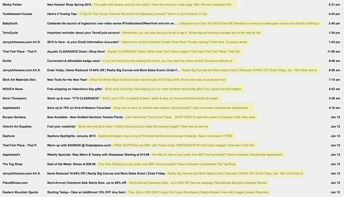
Preheader text is really important, and getting more important all the time
It may not get much attention anywhere else, but preheader text is extremely important in the inbox. The yellow areas in the screenshot above take up more space than the subject lines. Sure, the subject lines are in bold, but the preheader text still takes up more space.
From that view you could make an argument that subject lines and preheader text are equally important. I’m not quite ready to step out that far on a limb and assert that, but I think you’ll agree preheaders are pretty important. And vastly neglected.
But that screenshot is just a desktop view. As you know, half of emails are now viewed on mobile devices. How do emails look on, say, an iPhone?

This is an inbox viewed from an iPhone 6 Plus’ 5.5 inch Retina display:

Once again, there’s more space dedicated to the preheader than to the subject lines. These are just the views for Apple phones, but with the push to larger and larger smartphones and “phablets”, preheader text space is only getting larger.
I don’t want to go on too long about how critical preheader text is. I think you’ve gotten the point pretty well by now.
The gist is:
- Email preheaders are way more important than most of us give them credit for.
- New phone designs show they are only getting more important.
- Most email marketers give them way too little attention.
- You don’t have to be most email marketers.
Oh and did you know that emails that contain a preheader get on average 18% higher open rates?
You have a nice opportunity to get ahead of the crowd here. After reading this, you’ll be armed with the facts about preheaders, and you will know a few tricks to crush your competition. As for mistakes to avoid in your preheaders, we’ve got another article on this, here.
Sound good? Let’s roll.
How to craft effective email preheader text
- Think of the preheader like the subtitle of an article, with your subject line being the title.
- Write your preheader with the understanding that subscribers using different email clients will see different lengths of it.
- Use an easy to read font for your preheaders.
- Some email experts say to align the text of your preheaders left, because it makes the preheader easier to read.
- Test your preheaders just like you would test subject lines.
- If you’ve got personalization data, use it.
- Use dashes or plus signs to separate phrases, not periods.
- Consider adding navigation links, an unsubscribe link, a whitelist request or a forward to a friend link towards the end of your preheader text.
1) Think of the preheader like the subtitle of an article, with your subject line being the title.
Don’t repeat your subject line in the preheader. The copy of your preheader should start with a call to action. Then include a short summary of what your email is about, followed by a link to the landing page. If you still want to include the “View this email in a browser” link, add it to the very end of the preheader text.

All these preheaders start with a call to action, followed by a brief summary of what the email is about. The summary directly supports the call to action. Notice that all these preheaders also begin with a verb.
2) Write your preheader with the understanding that subscribers using different email clients will see different lengths of it.
Some email clients will show the first 75 characters, including spaces. If a subscriber is using Gmail on a desktop they’ll see about 100 characters. On an iPhone 6, they may see up to 150 characters. How much of your preheader someone sees also depends on how long your email subject line is.
It’s a tough trick for a copywriter to write a preheader that works well at all those different lengths. But that’s what we have to do. This is part of why preheaders open with a call to action. The marketer has decided that if a subscriber can only see one thing, they should see the call to action.
3) Use an easy to read font for your preheaders.
Arial in at least 12 point type is a good choice. When you send test versions of your emails, pay close attention to how easy or hard they are to read.

This preheader is fairly easy to read, but the background color could be lighter. It’s also centered, which is not recommended for preheader text.
Fortunately (or unfortunately) many of your subscribers will be reading your email on their phones, where the preheader text size is controlled. But keep in mind they will still spend maybe 3-4 seconds looking at your subject line, sender name and preheader. They will use those three things to decide whether or not to open your email. They may be distracted, and could be in less-than-perfect light. They could be walking down the street or waiting at a traffic light. Do you see why your preheader needs to be so easy to read?
4) Some email experts say to align the text of your preheaders left, because it makes the preheader easier to read.
But then we see examples like the one below, which breaks the left-align rule and still looks good:

5) Test your preheaders just like you would test subject lines.
Every GetResponse account is enabled with A/B split-testing for email messages. That includes preheaders.
6) If you’ve got personalization data, use it.
As you’ll see below, it’s easy to add a name field to preheader text. You can also add other fields as well. Personalization can be a powerful way to increase conversions. If it’s been working for you in your subject lines, why not test it in your preheaders?
Extra credit: Preheaders are almost a nice opportunity for adding a symbol, or emoji.
7) Use dashes or plus signs to separate phrases, not periods.
Preheader text has a breathlessness to it, so use punctuation to suit. Plus signs “+” are good for connecting phrases. So are dashes and “>>”.
8) Consider adding navigation links, an unsubscribe link, a whitelist request or a forward to a friend link towards the end of your preheader text.

Is there too much information and links for a preheader?
This is not the best tactic for everyone, but depending on your list and your goals, you can do more in the preheader than just announce the email. Try to keep things simple, though. Preheaders are kind of a tweetable version of your emails. Shorter is not just better: It’s expected.
So now that you know the rudiments of better preheaders, here’s how to add them to your emails.
How to add and edit the preheader text in GetResponse
Let’s say you want to customize the preheader of a new email message.
There are two ways you can do it.
First, create a preview text that won’t go into the body of your message and will only appear in the recipient’s inbox.
You can set it up in your email’s settings in the GetResponse Email Creator.

The second way method lets you create a preheader that’s also visible in your email body.
You can access it using the Header settings inside the creator like here:

Alternatively, you can switch off the header section and add your own block text at the top of the message just like that:

So that’s the skinny on email preheader text. If you get really good at using preheaders, you’ll be well-positioned as smartphones and other mobile devices continue to give them more visibility in the inbox.
There are, of course, other email marketing best practices to keep in mind when designing your campaigns.
One last thing: Have you run any A/B split tests on your preheaders? We’d love to hear about your results in the comments.
