Unlike web browsers, email clients interpret HTML in their unique ways, affecting the layout, functionality, and appearance of your emails.
With this guide, I aim to create a comprehensive HTML elements toolkit to help you optimize emails for different clients. Also, I’ll be referencing CSS, but the main focus is on HTML.
Supported HTML tags overview
Check the table featuring commonly used tags, including their function and compatibility with different email clients. Click on the tags to jump to a more detailed explanation and practical tips.
| HTML Tag | Function | Gmail | Outlook | Apple Mail | Yahoo Mail | AOL | Thunderbird |
| <b> | Bold text | ✅ | ✅ | ✅ | ✅ | ✅ | ✅ |
| <i> | Italic text | ✅ | ✅ | ✅ | ✅ | ✅ | ✅ |
| <ahref=””> | Hyperlink | ✅ | ✅ | ✅ | ✅ | ✅ | ✅ |
| <ul> | Unordered list | ✅ | ✅ | ✅ | ✅ | ✅ | ✅ |
| <ol> | Ordered list | ✅ | ✅ | ✅ | ✅ | ✅ | ✅ |
| <img> | Image | ✅ | ✅ | ✅ | ✅ | ✅ | ✅ |
| <table> | Table layout | ✅ | Partial | ✅ | Partial | ✅ | ✅ |
| <div> | Division for block-level content | ✅ | Partial | ✅ | ✅ | ✅ | ✅ |
| <span> | Inline text styling | ✅ | Partial | ✅ | ✅ | ✅ | ✅ |
| <form> | Form for user input | ❌ | ❌ | ❌ | ❌ | ❌ | ❌ |
Universally supported HTML tags: detailed explanations
Below, you’ll find the tags that form the foundation of email design and are reliable with most email clients. I categorized them based on the function; you’ll also find tiny code snippets showing how the tags are supposed to be used.
Basic text formatting
Universally supported text formatting tags are the following.
- <b>: makes the text within the tag bold
| <p>This is a <b>bold</b> statement.</p> |
- <i>: makes the text within the tag italicized
| <p>This is an <i>italic</i> word.</p> |
- <u>: adds an underline to the text within the tag
| <p>This is an <u>underlined</u> word.</p> |
- <p>: defines a paragraph of a text, important for organizing copy into readable blocks
| <p>This is a new paragraph of text in the email.</p> |
- <strong>: creates a strong emphasis; similar to <b>, but more semantically meaningful
| <p>This is a <strong>strong emphasis</strong> on a point.</p> |
- <em>: similar to <i>, but it’s used for subtle emphasis; you can use it to highlight key words and phrases elegantly
| <p>This is an <em>emphasized</em> word.</p> |
Reminder: The tags above are reliable across Gmail, Outlook, Apple Mail, Yahoo, and other clients. Your styling will remain consistent across these platforms.
Links and anchor tags
Sure, the <a href=””> tag is universally supported, but there are some specific quirks I’d like to draw your attention to.
- Basic usage: define the hyperlink with the <a href=””> tag, ensuring it includes the full URL to prevent errors.
| <p>Click <a href=”https://example.com”>here</a> to learn more.</p> |
- Gmail: supports inline styling within anchor tags, so you can customize the appearance of links with CSS (e.g., color, text-decoration).
- Outlook: often strips CSS styles from links, so you need to use the text-decoration function directly within the tag.
| <a href=”https://example.com” style=”text-decoration: underline; color: #0000EE;”>Visit Our Site</a> |
- Apple Mail: generally respective of styling within <a> tags, so you’re flexible with colors and underlines.
To stress, testing links across different clients is essential as the support level could change. I’ll cover the details under the “Best practices” section.
Ordered and unordered lists
Lists are supported across the board (both <ol> and <ul>), but note that spacing and indentation may vary. Here are basic examples.
- Unordered lists
| <ul> <li>First item</li> <li>Second item</li> <li>Third item</li> </ul> |
- Ordered lists
| <ol> <li>First item</li> <li>Second item</li> <li>Third item</li> </ol> |
Pro Tip: Outlook may sometimes add extra spaces around list items. If you use CSS padding adjustments with the <li> element, you can fine-tune the layout consistency.
Image support
Again, images are widely supported, but certain attributes and image behaviors may vary, particularly with Outlook and Yahoo Mail.
- Primary usage:
| <img src=”https://example.com/image.jpg” alt=”Description of image” width=”600″ height=”300″> |
Attributes:
- src: specifies the image URL. Use absolute URLs, as relative paths usually don’t load correctly.
- alt: provides alternative text for accessibility; this could be invaluable if your images fail to load.
- width and height: define the explicit dimensions to control image display and prevent resizing issues with Outlook.
Client-specific considerations:
- Outlook: It may ignore certain styling or images. For example, this typically happens with max-width, which causes images to appear stretched. To overcome this, use the exact dimensions and avoid relying solely on CSS for responsiveness.
- Yahoo Mail: It has limited support for custom image styling. You need to test the email template thoroughly, mainly if it uses images with backgrounds or borders.
Tip: Keep the images within a fixed width or rely on pixel values rather than percentages. This helps ensure images render well with most clients.
HTML tags with limited or partial support
Partially supported and limited support tags require specific workarounds to get the consistency you’re looking for. I’ll briefly cover the basic structure, attributes, workarounds, etc.
Tables
Even though table renderings are common in email layouts, they can vary. The discrepancies are the most obvious with Gmail and Outlook. Check the examples and tips to retain precise control over the email structure.
- Basic table structure:
| <table width=”100%” cellpadding=”0″ cellspacing=”0″> <tr> <td>Row 1, Column 1</td> <td>Row 1, Column 2</td> </tr> <tr> <td>Row 2, Column 1</td> <td>Row 2, Column 2</td> </tr> </table> |
Attributes:
- width: define a fixed width for tables to maintain consistent layouts with different clients.
- cellpadding and cellspacing: make sure to control both attributes or your spacing may appear off.
Client-specific tips:
- Gmail generally supports tables but could require inline CSS for padding and margin adjustments. Also, avoid nesting tables too deeply to prevent display issues.
- Outlook renders tables using the Microsoft Word engine (a nightmare if you ask me 😀), which often disregards CSS-based layouts. To get desired consistency, specify widths within the <td> tags and steer clear of advanced CSS to define positions within tables.
Here’s an example of a consistent table styling:
| <table width=”100%” cellpadding=”10″ cellspacing=”0″ style=”border-collapse: collapse;”> <tr> <td style=”width: 50%; background-color: #f0f0f0;”>Column 1</td> <td style=”width: 50%; background-color: #cccccc;”>Column 2</td> </tr> </table> |
Input elements and forms
Forms and other elements are not widely supported, so avoid using them directly in your emails. But, of course, there’s always a workaround; check the details below.
- Unsupported elements: <form>, <input>, <button>, and <textarea> typically won’t function in Gmail, Outlook, or Yahoo Mail.
- Workaround: Use a call-to-action link and direct users to a landing page where they can fill out a form.
| <p>We’d love to hear from you! <a href=”https://example.com/feedback” target=”_blank”>Click here to leave feedback</a>.</p> |
Divs and spans
Being partially supported across different clients, the <div> and <span> tags are often used in combination with inline styles to improve compatibility. I’ll cover the basic usage and some tips and tricks (there’s really no workaround here).
Basic usage:
- <div>: typically used for block-level elements, it helps organize different sections within an email.
- <span>: this is an inline container often used for styling specific text elements.
- Inline styling: As indicated earlier, a lot of email clients strip the embedded and external CSS, making inline styling essential for these tags. ⬇️Check the exemplary snippet on how to use the <div> tag.
| <div style=”background-color: #f0f0f0; padding: 10px;”> This is a div with background color and padding. </div> <p>This is a <span style=”color: #ff0000;”>highlighted</span> word.</p> |
Client-specific tips:
- Outlook: it may ignore certain inline styles; I suggest using the <table> element for more complex layouts.
- Responsive design: Gmail and Apple Mail support media queries so it’s possible to adjust <span> and <div> styles for mobile devices. However, the responsiveness of such emails can be unpredictable with Outlook. To overcome that, use fallback designs for complex layouts.
Client-specific considerations for HTML rendering
Check how to tailor your HTML for Gmail, Outlook, Apple Mail, and other commonly used email clients.
Gmail
Overall, Gmail supports many CSS and HTML features; even so, the client has its quirks. Here’s what to keep in mind.
- CSS: Gmail supports basic inline CSS and some media queries. However, it doesn’t always render external and embedded styles reliably. Therefore, it’s best to rely on inline styles instead.
- Known Gmail rendering issues:
- Image blocking: Quite often, Gmail blocks images by default, and users need to enable them manually. Add alt text to <img> tags to maintain email accessibility when the images are blocked.
- Media queries: Gmail supports media queries on mobile, but it doesn’t support media queries in desktop apps. So apply media queries only for mobile-specific styling.
Outlook
To remind you, Outlook uses Microsoft Word’s rendering engine, which can trigger unexpected issues. I already mentioned a few tips on how to overcome this, so this section is like an extended recap.
- CSS and HTML limitations: Outlook typically ignores CSS properties such as margin, padding, and float. To work around this, rely heavily on <table> elements for layout, cell padding and cell spacing attributes.
- Images: If images lack explicit width and height, Outlook is likely to display them incorrectly. So, make sure to define those attributes.
Here’s an example of code for a table-based layout with cell padding and cell spacing.
| <table width=”100%” cellpadding=”10″ cellspacing=”0″ style=”border-collapse: collapse;”> <tr> <td style=”background-color: #f0f0f0;”>Content Area 1</td> <td style=”background-color: #cccccc;”>Content Area 2</td> </tr> </table> |
Quick tips:
- Use tables for layouts due to the limited CSS support.
- Avoid complex layouts with nested tables.
- Test email template designs with Outlook desktop and web versions – they may render differently.
Apple Mail and other clients
Arguably, Apple Mail has the strongest support for HTML and CSS, making it one of the most reliable clients for advanced email design. Here, I’ll also offer some tips and tricks for Yahoo, AOL, and some other clients.
Apple Mail:
- Supports inline and embedded CSS and media queries.
- You can render robust HTML5 elements and have gradients, animations, and web fonts.
Important Note: Even though Apple Mail supports it, go easy on complex styling, web fonts, and especially animations. There’s a high chance other clients won’t support them, and they may affect email deliverability, not only accessibility.
Yahoo Mail:
- Supports inline styles and embedded CSS. However, some advanced properties like display: flex may not render properly.
- Yahoo often blocks or delays image loading, so you should include alt text.
AOL and Thunderbird:
- These clients have HTML/CSS support similar to Yahoo. But Thunderbird offers a more reliable rendering of embedded and inline styles.
- Generally, avoid advanced inline techniques. The same goes for advanced CSS layouts such as flexbox (applies to Yahoo, AOL, and Thunderbird).
Best practices for using HTML tags in emails
Truthfully, this whole article is like a list of best practices. So here, I’d like to focus on testing and the Mailtrap Email Testing tool. And I’ll also cover tips on creating mobile-responsive designs.
Email testing across different clients
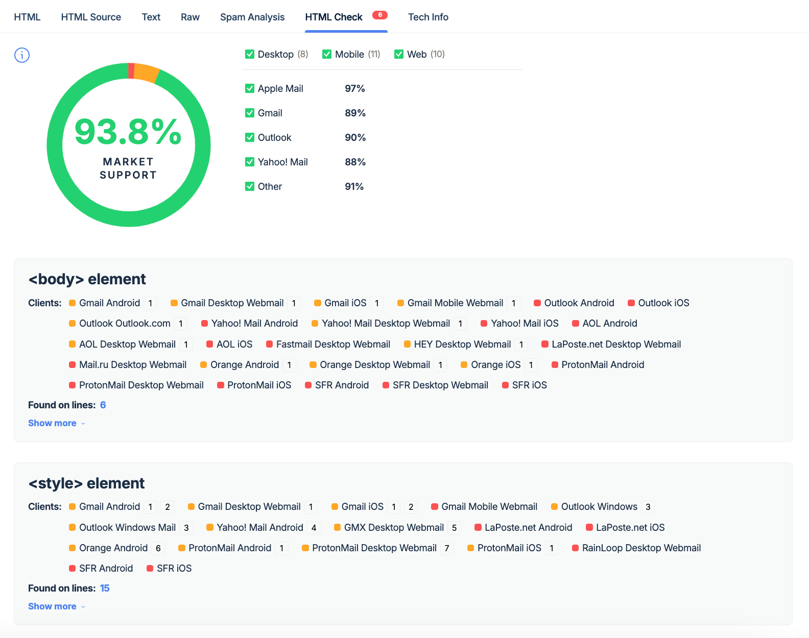
I’d always recommend a tool that explicitly shows support across different email clients and gives you exact references to which lines of code might be problematic.
Mailtrap Email Testing is one such tool. It’s part of the Mailtrap Email Delivery Platform and an email sandbox for inspecting emails in staging, dev, and QA environments.
The important thing is that it offers the following:
- HTML/CSS check (with percentile client support and explicit references to problematic lines of code)

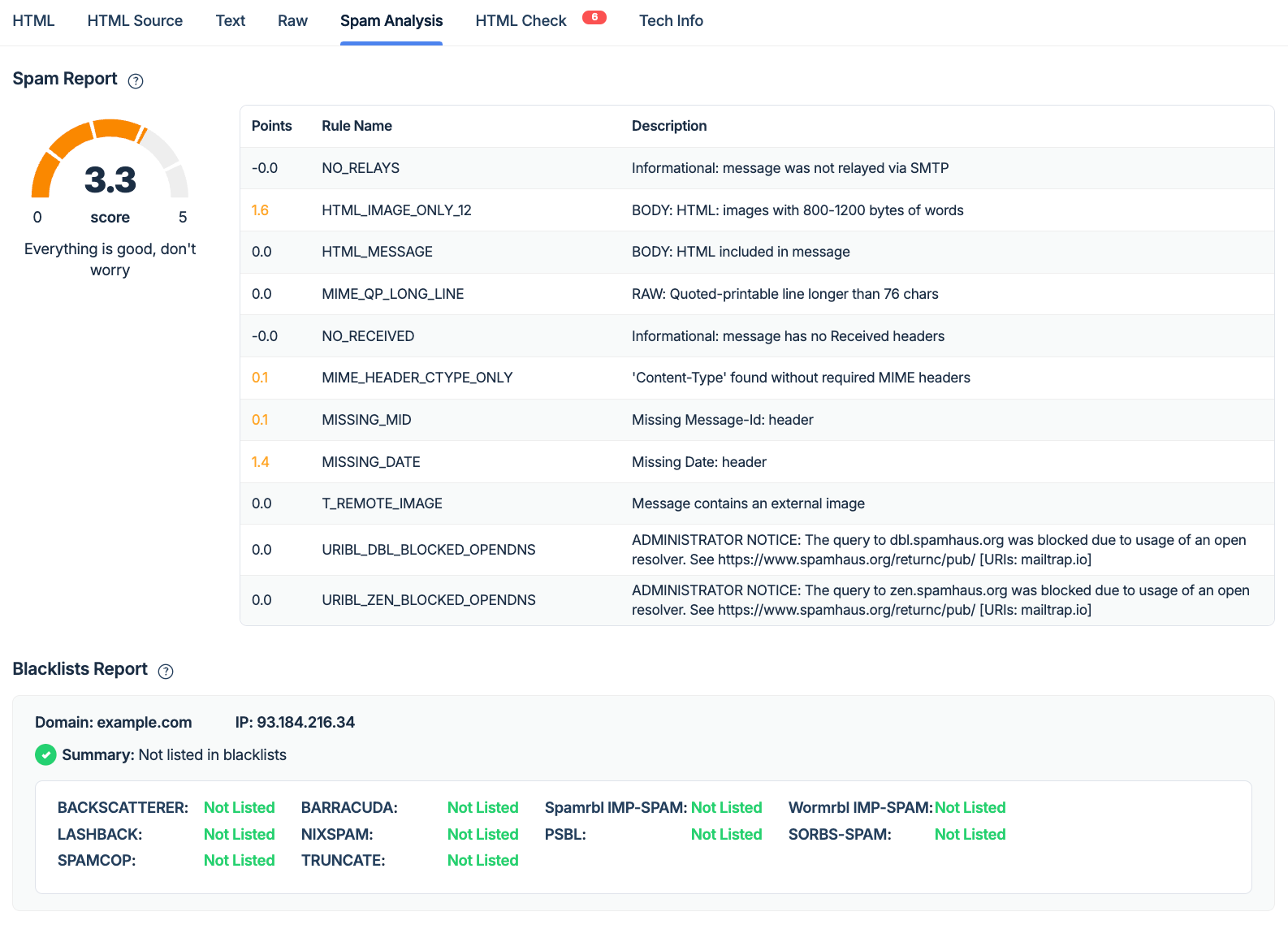
- Spam score check

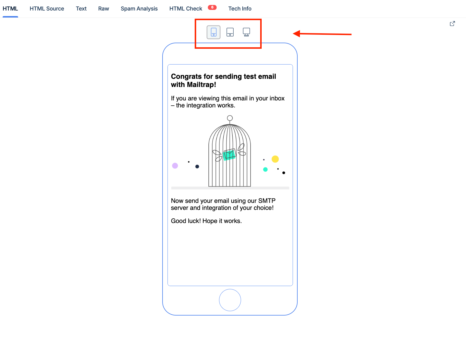
- Email preview (web, mobile, and desktop)

If you need to test a lot or have multiple projects, Mailtrap Email Testing also offers API for QA automation, multiple testing inboxes, user management, and email template testing via API.
For Mailtrap Email API/SMTP users, API allows for an easy transition from testing to production requirements. You can change a few lines of code and send your templates as soon as you’re sure they’re ready for recipients.
Mobile responsiveness
Previously, I mentioned some tricks for mobile responsiveness, and in this section, I combine them and give you some hands-on tips.
- Use inline styling to define mobile-friendly properties such as padding, font size, and line height.
- You can use media queries to adjust layout, font size, and images for mobile screens. However, don’t forget that Outlook doesn’t support these, unlike Gmail and Apple Mail. Here’s a quick example.
| <style> @media only screen and (max-width: 600px) { .responsive-text { font-size: 14px; padding: 10px; } } </style> <p class=”responsive-text” style=”font-size: 16px; padding: 20px;”>This paragraph is styled for desktop and mobile.</p> |
- A single-column layout scales well across different devices, that’s why you should use it for mobile.
- Use larger fonts and buttons to improve accessibility and readability on smaller screens. Also, mind the CTA hit area and their hierarchy; see the ballpark values below ⬇️
- Gmail: 36 x 48 pixels
- Apple Mail: 48 x 48 pixels
- Outlook: 26 x 34 pixels
Wrap-up
By now, you’re equipped with all you need to use HTML tags in your emails effectively. And yes, it’s a careful balance between universally supported tags, your design, and the tags that need some clever workarounds.
But don’t forget, your job doesn’t stop when you have a highly accessible and deliverable template. You need to keep testing and refining your approach since email clients will keep evolving.
