One of the best ways to market yourself as a therapist is through a website. It helps you build an online presence, trust, and attract new customers.
In fact, the latest web design statistics show that post-COVID, 68% of consumers say that they have higher expectations for businesses’ digital capabilities following COVID-19, and 30% won’t consider businesses without a website full stop.
Yet only 64% of small businesses have a website. Why the holdup?
Cost and time are two of the most commonly perceived issues. But this couldn’t be further from the truth: thanks to DIY website builders, making your own site has never been easier, quicker, or cheaper.
In fact, most small business sites you visit are built by people with no technical knowledge whatsoever.
There are numerous options to choose from. But before you dive in, it’s a good idea to read the fine print so you don’t end up paying for extras you don’t need or end up with cheesy stock images or a design that belongs in the ‘90s.
After all, you work in a sensitive field — it’s important you look credible.
To help inspire you, we’ve found 15 brilliant examples of therapist websites to help you get started with your own. Let’s dive in!
15 Brilliant Therapist Website Design Examples
1. Empower Family Therapy

We love this site’s bold title: ‘family time shouldn’t suck’. Written in approachable language, it hones in on a problem that many with family troubles or mental health issues struggle with: finding it difficult to be around loved ones. Straight away, it offers both solidarity and hope.
We also love the bustling, joyful photography combined with the bold, no-nonsense typeface. It’s modern, honest, and simple.
Meanwhile, calls to action (CTAs) are easy to spot, while the navigation along the top is clear and helpful. The location is also featured as a subheader — it’s just a little more information that makes the visitor’s life easier.
2. Alex Pesenka

Chic colors, easy-to-navigate icons, and a live video chat option — what’s not to like?
Knowing color psychology can help boost conversions, and this site has gone for gold. Green is a calming shade, and when you’re selling therapy services, calming is good. Not only that, but this particular shade of deep green was one of 2021’s trending colors, giving the app/site a contemporary feel. The elegant lettering and minimalist interface design only add to the appeal.
Bonus points for including photos of the available therapists at the top, adding a personable touch to the experience.
3. Millennial Life Counseling

It’s usually better to niche down than to cast the net wide — and this website does just that. This therapist targets a very specific age group: millennials.
According to the latest web conversion statistics, calls-to-actions that are surrounded by more negative space and less clutter had an increase in conversion rate of 232%. The designer has done just that on this site: The layout is pared back and the CTA stands out in bright orange against a plain white background. Meanwhile, the central copy speaks directly to the priorities of 20-30-somethings: marriages and relationships.
4 Jonathan Sheehee, LP

Jonathan’s website is modern, professional, and welcoming all in one. A friendly photo of Jonathan, combined with a short introduction helps foster an instant connection, while the ‘how Jonathan works’ CTA makes it easy for visitors to find the information they need right away.
At the top, three simple navigation options keep the site feeling simple and straightforward — while the clean layout keeps things looking modern.
5. Tubik

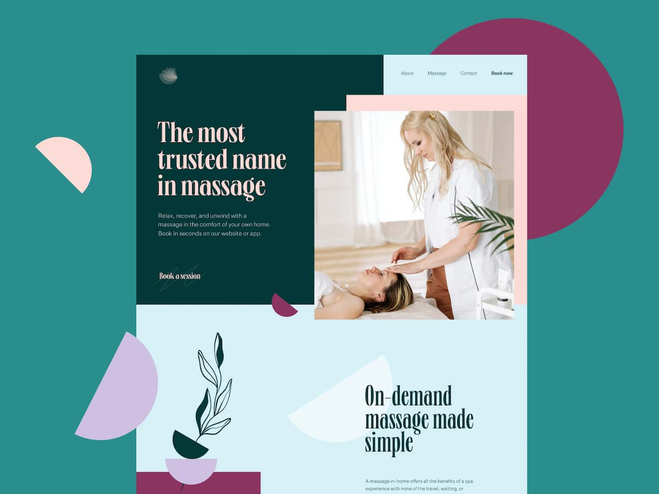
The personality shines through on this one. The design manages to be both calming thanks to the color choices, and playful, thanks to the abstract shames (one of this year’s biggest design trends). A chic typeface and professional photography are the cherry on the cake.
More related content:
1. How to make a website from scratch in 9 easy steps
6. Banana Jane

We bet you’ve never seen a therapist site quite like this one. Bursting with personality, Banana Jane makes use of on-trend pastel shades, a fun moving image (the banana unpeels), and playful fonts to create a truly appeeling (see what we did there) design.
Not only does this help the user connect with Jane – it also does take a lot to relax the user and make booking a session feel like something easy and fun.
7. Taras Migulko

Booking therapy can be a daunting experience. Luckily, this design makes the process feel quick, easy, and non-intimidating: the psychologist and therapist options are placed among optometry and nutritional help, while playful illustrations and friendly real-life photography add approachability.
UX design is great here too: CTAs are clear, information is easy to find, and the ‘make an appointment’ button pops in bright orange.
8. Ellie Vargas Therapy

Greens and blues are famously calming colors — and they work, which is why so many therapists choose them. The downside is, if you use them, you risk blending in.
We love the playful typeface and equally playful yellow and white color scheme on Ellie’s site. The design also features a warm, friendly picture of Ellie herself, which helps foster an instant connection between her and her audience. Her copy says ‘innovation and contemporary’ and everything about this site’s design backs this up.
9. Michelle Harwell Therapy

Crisp photography and a clean typeface combine to create a thoroughly contemporary looking site. We love its warm take on the classic psychologist’s couch trope, while the use of ‘you’ in the subheader makes the whole thing feel both warm and personal.
10. Rachel Rudman

This site is a great example of how it’s possible to exude a vibrant personality without the use of photography. A bold font with rainbow coloring screams ‘playful’, while the little handprint supports the hands-on, practical approach of this therapist.
The minimalist design keeps things looking fresh, while the simple tabs along the top of the page make it easy for visitors to find the information they need.
11. Mommy Speech Therapy

Another example of how warm, playful, and friendly can be achieved without the use of photos. We love this typeface, which has been created to look as though a child has had a hand in its creation. This is just right for the audience: if you’re booking a therapist for a little one, you want to know they’ll be able to connect with them on their level — and an overly serious or stuffy design just won’t do that.
Bonus points for including an ‘inspiration’ tab, as well as free downloads — both of which are a great way for this therapist to offer visitors something useful for free and prove their expertise.
12. Jessamy Holland Therapy

No cheesy stock photos of couples looking sad here! Clean, clear, playful, and very clever: this site’s illustration is a brilliant metaphor for couples who are feeling a little distant from each other, but are within arm’s reach. It’s both realistic, and hopeful — something you want therapy to be.
Bonus points for the contemporary color scheme, typeface, and site design.
13. Shifting Tides Therapy

Ever seen a therapist website that gets a bit sweary? Us neither, until now. This site has the holy trinity of great site design: personality, specificity, and clarity. We know exactly what this therapist is like (fun, approachable, playful), we know who she works with (millennial women who need a little guidance), and we know what she offers and where she is.
We also love the friendly photo, the contemporary sans serif typeface, and the crisp design. 10/10.
14. Miriam Mogilevsky

We all want a therapist who gets us and knows what we’re going through. So Miriam’s placing her cancer survival front-and-centre is a brilliant way to show prospective clients who may be going through the same thing. It tells visitors she understands their needs through real, lived experience — and that’s hugely valuable.
Style-wise, we love the clean design, the joyful rainbow palette, the chic typeface, and personal photograph. Miriam’s personality comes through in spades.
15. Theraphe

The more specific you can be, the better — and this site’s nailed it. It’s masculine without being macho in a cliched way. It includes positive, aspirational photography, and it addresses something head-on: that men are less likely to seek counseling than women. Not only does this address that, but it promises in just a few words that this service will be different.
Bonus points for the thoroughly contemporary font and color scheme, the minimalist layout, and the clear CTA that stands out in green against the monochrome background.
Key takeaways from these 15 therapist website examples
Each example has something unique or utilizes a combination of features that just work. Here are the main takeaways that you can apply when building your own website for your private practice.
- Let your personality shine. Therapy involves a lot of one-on-one time, so your prospective customers will want to know whether they click with you. One of the best ways to do that is to make your site your own. Use warm photos of yourself, choose colors, typography, and photography that suits you and your brand. The more unique and true to yourself you are, the better you’ll connect with your ideal clients.
- Use social proof to build trust. Quotes and testimonials from past and existing clients are a great way to show your audience you don’t just talk the talk.
- Build your site for conversion. Don’t treat each page as a standalone thing: consider your visitors’ end goals. Make it easy for them to navigate through your site and find the information they need by planning your pages and navigation.
- Build an email list. Lots of the above examples feature pop-up forms and other resources designed to encourage subscriptions. Using Getresponse, you can easily start an email list and start capturing leads on your website.
Editor’s note: It’s also important to make sure your therapy website can be easily found online via the search engines such as Google or Bing. To achieve that, you’ll want to invest in the so-called search engine optimization (SEO), which overlooks many aspects such as the speed of your website, the quality of your website’s content, and many others. The following article will provide you with several tools and tips on how you can ensure your content’s SEO-optimized.
Important pages and features to include on your therapist website
- Home page
- About page
- Services and prices
- Testimonials
- Contact form
- Social media links
- Newsletter sign-up form
- Blog
- Live chat
Wrapping it up
A website is a great way to market your service as a therapist, as well as a way to build your brand and let future clients know who you are and what you do. Whatever your business or goal, be sure to let your personality shine through, and create a user-friendly website that makes it easy for your audience to find the information they need.
Using a dedicated website builder is a great way to get your private practice website set up and running quickly. With GetResponse, you can create a personalized website with the help of AI in minutes, meaning you can be up and running with a professional-looking site within a day.
To learn more about this code-free website builder, watch the quick video below:
