How to make messages look good in Outlook?
Some versions of Microsoft Outlook may have different approach of displaying email messages. This article describes the most common discrepancies.
Note that we have no control over how Outlook renders messages, however, we would love to provide some hints on how to minimize the display changes made by this application.
Lines are added automatically to the message
The lines inherit the color of the background in an email’s body, so you may start by adjusting the color of the background. Also, putting everything in one section rather than splitting it into different sections might help (just don’t make them too long). Sometimes adjusting the font size helps, too.
Animated gifs are not displayed
Animated gifs are not supported in Outlook versions before 2019. If you want to use GIFs in your message just make sure the most important information is on the first frame of the GIF so they will be visible for users of older versions of Outlook too.
Padding and margins are not displayed
Certain versions of Outlook will remove the padding in a variety of situations. One of the most common involves image padding, which when ignored can cause text to appear flush against an image. To get around this, add a border in the same color as the background to the image instead of padding.
Desktop versions of Outlook don’t support the styling of <div> tags, which means some line breaks will not be respected. Interline will also be ignored.
My background and styling are not displayed
Outlook does not support some styling options. For example, rounded borders will not work.
Outlook also removes link styling if you add a URL without http:// or https:// in your links (custom protocol links, for example).
Outlook does not support the following CSS styles:
- background-attachment
- background-image
- background-position
- background-repeat
- clear
- display
- float
- list-style-image
- list-style-position
- text-transform
- word-spacing
so if, for example, you use an image as a background, it will not be displayed in Outlook.
My image is not displayed
Outlook has a maximum scroll height limit, which is 2000 pixels. If an image is higher, the display images option will not appear for that image.
Also, larger paragraphs will be cut.
My font is not shown
Outlook supports a fixed number of fonts – we suggest always setting a fallback for any custom fonts you are adding. A fallback font is a font that will be loaded when your selected webfont cannot be displayed on a given email client. Safe fonts include:
- Courier
- Courier New
- New Arial
- Arial black
- Veranda
- Tahoma Georgia
- Times New Roman
Issues with message width
An Outlook-friendly width is 550-600px – wider messages may not display well in Outlook.
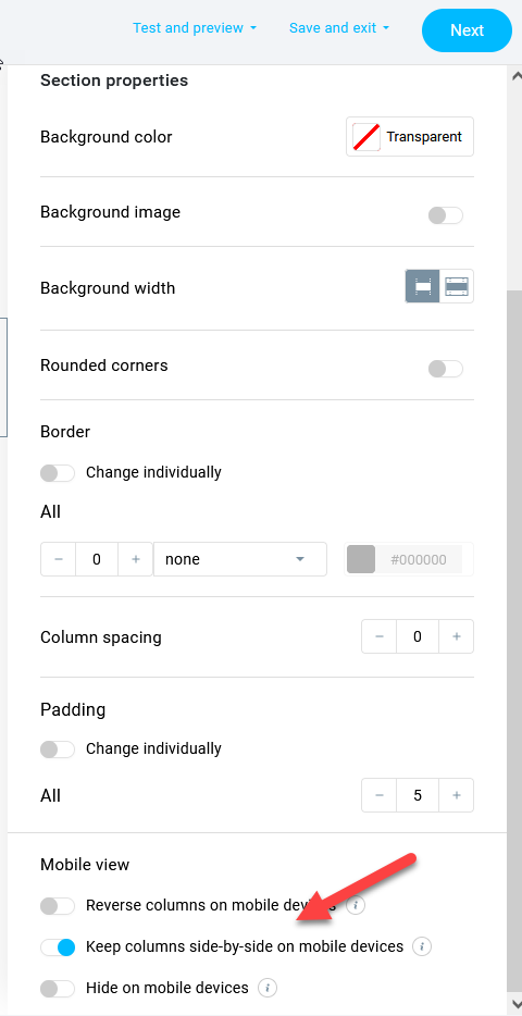
Two columns are stacked into one
Some desktop versions of Outlook try to stack content in the columns showing the responsive email templates that are meant to be displayed on mobile devices. If you want to avoid that, select Keep columns side-by-side on mobile devices in the properties of the mobile view of the message.

Images have different size
Microsoft Outlook adjusts the image’s resolution to 96 dpi automatically, so make sure to adjust the image before uploading it into Files and images.
My link is not wrapped
Some versions of Outlook may not wrap long links unless that is selected in Outlook’s settings.
Other things to remember
- The older the version of Outlook, the less likely it is to support some of the HTML5 styling.
- Desktop versions are not updated as fast as browser ones, so there will be discrepancies depending on which version you use.
- Test the message in inbox preview to see how it will be rendered by Outlook.
- Use links to the online version of the message to allow the subscribers to view unaltered message in the browser.
- Make sure the text was not copied from an external editor – a lot of unsupported formatting which may not be visible in the creator may be read by Outlook and mess up the layout.


