Poor pop-ups. Everybody calls them annoying, bad and spammy. But they don’t have to be. Pop-ups don’t have to be bad. They are actually a list-builder’s secret weapon. But when they’re used the wrong way, pop-ups can get pretty annoying. Yours don’t have to be.
Pop-ups (also called “pop-overs” or “interstitials”) work so well that even if you tone them down a bit, they work better than almost any other list-building tactic.
30-100% Increase in opt-ins
You can realistically expect that adding a pop-up will increase your opt-in rate by 30-100%. That not hype: That’s normal. There are reports of pop-ups increasing opt-in rates by 1000% or more, but those are unusually good results. Let’s stick with what you can realistically expect.
You, right now – today – can get 30-100% more email subscribers if you add a pop-up to your site. This is especially easy for you to do, because GetResponse gives you a way to shift any opt-in box into a pop-up (or lightbox) with just a few clicks. You don’t need to install any plugins or to spend any money. You’ve already got everything you need.
Related: What are pop-ups? Definition, types, and examples
How to create a pop-up in your GetResponse account
Read this detailed guide on creating a popup in 5 easy steps.
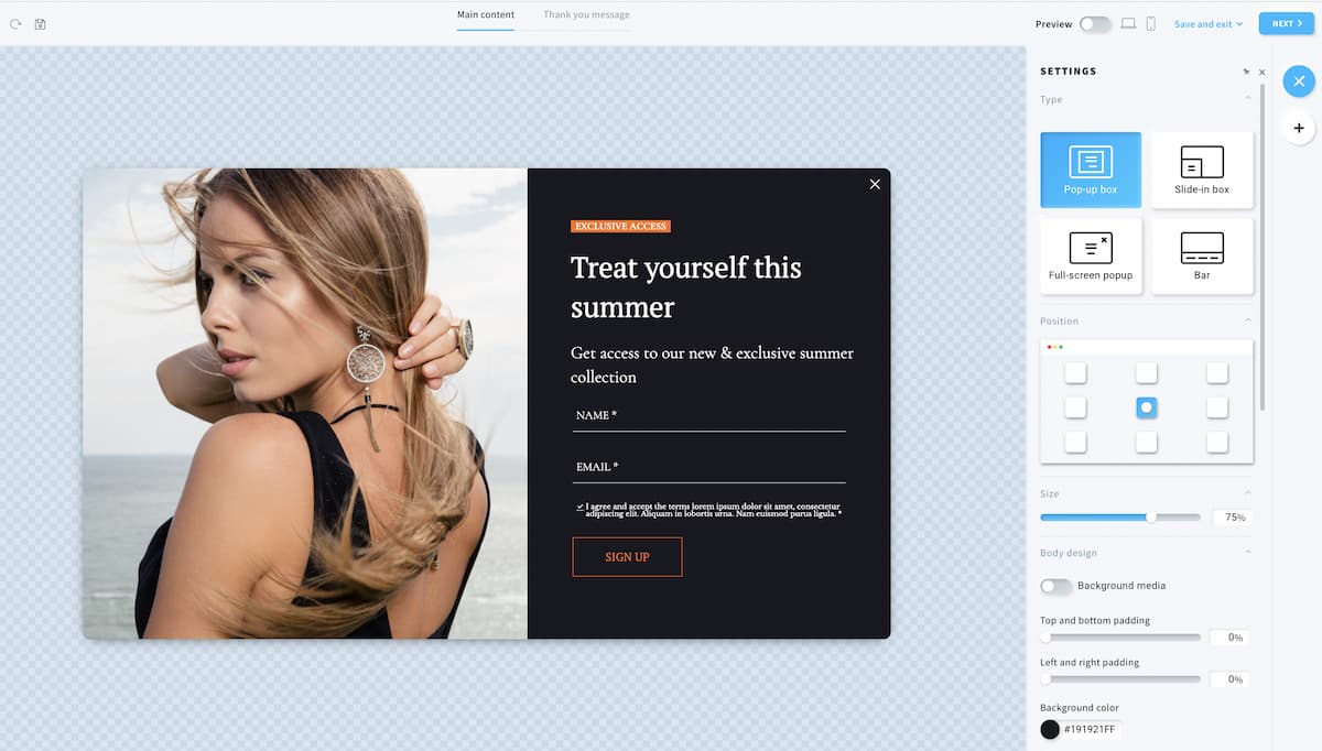
To do this, log into your account, and go to “Forms and popups” in the top navigation bar. Find the popup template and click “use template.”
There, you’ll be able to edit your popup’s design, and in the display rules settings, you’ll be able to choose how your popup will be displayed to your visitors.

Pro tip: Personally, I like lightboxes, i.e., popups with a dimmed overlay, because they make a visitor focus more on the opt-in form, but you should test if that works best for you.
The real reason people don’t use pop-ups
So now you know how easy it is to create a pop-up in your GetResponse account.
Know what, though? I bet a lot of you already knew that. And I bet you already knew pop-ups work. I bet a bunch of you don’t care.
You don’t care because you already know pop-ups work, but you think your visitors will hate you if you use them. You’re just not willing to sell out like that – you’re not going to have your site be one of those spammy, pushy sites everybody hates. Fair enough. I have good news for you. Pop-ups don’t have to be annoying. You can have a pop-up, and still keep your website visitors happy. Here’s how:
1. Delay the pop-up
Let’s start with the most annoying aspect of pop-ups first: They come up right as you land on the page, clamoring for you to enter your email address to get some report that’s way too much like every other free report you’ve seen.
You don’t want this report. You just landed on this site, and you don’t even know if you like this place yet. You definitely aren’t ready to just hand over your email address… because if they’re this pushy now, what will they be like in your inbox?
Solution: Delay the pop-up so it doesn’t show when people first land on the page.
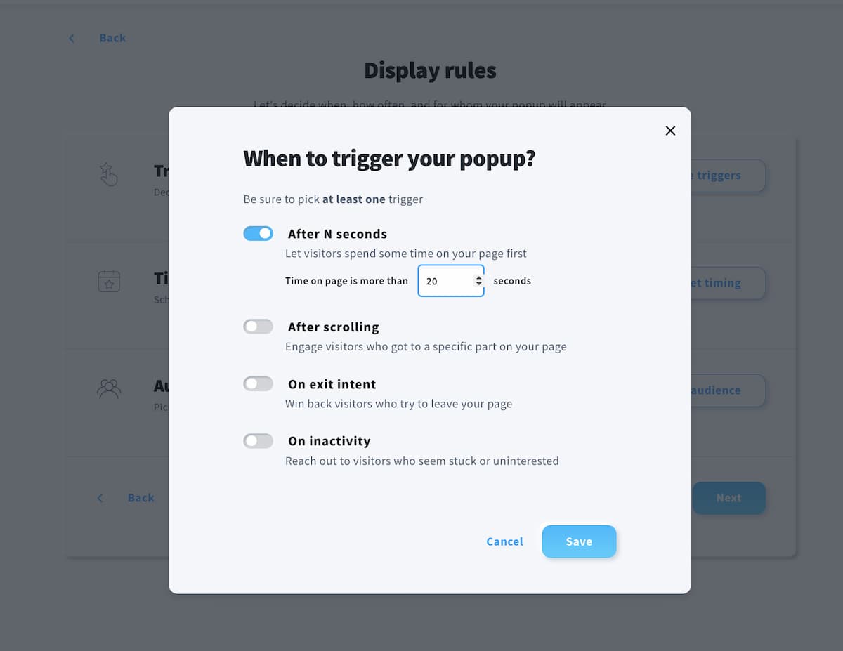
This is really easy in your GetResponse account. There’s a setting to do it inside the editor:

I recommend you set this to the maximum, so it shows 20 seconds after people have been on your site. With that one setting, you’ve swept away much of the annoyance factor with your pop-up. Pretty simple, eh?
If that’s still too invasive for you, I’ve got another trick for you.
2.Don’t show the pop-up on every page
Don’t you hate when every page you go to on a site results in a pop-up? You’re not alone. Showing pop-ups more than once per visit is probably the second best way to annoy your visitors, right after showing the pop-up immediately.
And again, there is a solution. If you’re still in your GetResponse account, looking at the web form editor, you’ve probably noticed the “Frequency” and “Timing” settings. That’s where you can control how many days pass between when your subscribers see your pop-up.
Changing this to 3, 7, 14 or even 30, 60 or 90 days will show your pop-up only that often. So changing this setting to 7 means your visitors will see this pop-up once every 7 days.

I don’t know about you, but when something happens every minute or so, it’s FAR more annoying than when it happens only once a week. Setting your pop-ups to show every few days means you’ve once again made them far less annoying than those other bad, pushy pop-ups no one likes.
3. Don’t use a pop-up at all
If you still can’t abide by pop-ups, even if they only show only once a week, there is another alternative: A scroll-triggered box (sometimes called slide-in popup).
Usually, people scroll down a page as they read, so to have an opt-in box appear after someone has scrolled down 60, 70 or 80% of a page usually means it will show after someone has had a chance to read, watch or see some of the content on the page. That usually means they’re interested in the content. And if they’re interested in the content, they might be interested in signing up for your list.
And again, you can use GetResponse Forms and Popups Creator to build this scroll-triggered box. Just head over to the trigger settings, and choose “After scrolling”:

And here’s a popup template that’d work great for this:

This type of popup shows the opt-in box in the bottom right-hand corner of pages (you can adjust that, too), which is much less invasive than showing it in the middle of the screen. I’ve had excellent results using this plugin on websites where the client just could not accept a pop-up but realized they needed something more active than the standard static opt-in box.
You could actually use the scroll box to promote anything –you could add a Facebook like box, a video… whatever you want. You can also control where the slider shows – say, when people are 60% down the page, or 80% down the page.
4. Don’t offer weak content
The last big reason pop-ups are annoying is that they’re usually not worth the interruption they cause. They’re “just ads”. You want your pop-ups to offer something that’s perceived as far more valuable than that. Offer content that’s worth the interruption.
A pop-up that offers the same boring generic diet report that’s on a thousand other sites is always somewhat annoying, even if it is shown at a delay and only once per visit. But (for example) a week’s shopping list for a diet targeted perfectly for your ideal audience, that only costs $15 per day – that might be interesting enough to be worth the interruption. And that’s what would make it less annoying.
