After promoting your course across various online platforms, you need to lead potential buyers where they can learn more about the course and decide whether or not it’s for them. That’s the essence of a course landing page.
A poorly designed online course landing page can impede your marketing efforts. You’re doing all the work to get attention but seeing little to no result. That’s not encouraging.
So, today, we’ll walk you through some vital steps and best practices for designing your own course landing page.
What is a course landing page?
A course landing page is a web page designed specifically to promote or sell your online course. It’s quite similar to a product landing page for an ecommerce site.
For example, here’s a landing page created by Uxcel to promote their UX writing course:

An effective course landing page provides detailed information about your online course, indicating what students will learn and how they can enroll or purchase the course. Essentially, it’s where you convince visitors that taking your course can help them achieve a desired goal.
Importance of a course landing page
Unlike a regular homepage created to serve multiple purposes, a course landing page is built for one specific goal. That allows you to take a more targeted approach toward selling your course.
For instance, it lets you share comprehensive details about the course to convince customers about its value. This would hardly be possible if you only dedicate a small section of your home page—or any other web page to selling your course.
Also, a dedicated online course sales page allows you to track user behavior and other analytics more accurately. This way, you can observe how well your course promotion efforts are doing. For example, you can see insights like where your traffic comes from or how leads engage with your page. This makes it easier to optimize your course marketing strategy.
It’s even better when using a dedicated course creator like GetResponse. Our all-in-one, AI-powered suite will help you create and promote your online courses with ease. You can create dedicated landing pages for your course and use features like email marketing, live webinars, and paid ads to sell your courses effectively.
👉 Learn about the GetResponse Course Builder and start monetizing your knowledge today!

How to launch your course with email marketing
Launching your online course? Then grab this ebook today and learn how to use email to promote your course effectively.
How to design a high-converting landing page for your online course
Let’s look at the ten vital steps to creating a high-converting course landing page.
1. Define your target audience
Defining your target audience is one of the most important aspects of creating a high-converting landing page for your course.
Knowing your ideal student allows you to craft clear and convincing copy on your landing page. You’ll understand their specific needs and goals, making it easier to show how your course is valuable to them.
Beyond building the landing page, understanding your potential learners allows you to direct your entire course marketing efforts.
Here’s what to focus on when defining your ideal customer:
- Demography – age, gender, and location.
- Pain points – motivations, problems they need to solve, or what they wish to learn.
- Level of knowledge – beginner, intermediate, or advanced.
For a professional course, you can also include details like:
- Job roles – is the course for customer representatives? Marketers? Sales reps? Etc.
- Organizational levels – i.e., entry-level, senior, or managerial employees.
How do you get these details about your audience?
You probably already had a group of people in mind before creating your course. But you still need to refine your audience definition further. You can look at existing courses that are similar to yours.
Take note of what the current and past learners say. Look at reviews, testimonials, questions, etc. You can tell what your potential learner wants to gain by what has been said about similar courses.
Gather feedback from your existing audience if you already have a good following. Use a survey to get information like demography, job roles, learning interests, etc.
Assess online conversations related to your course topics, too. You can do this with social listening tools like Sprout Social. Look out for questions they’re asking or issues they complain about.
With a clear understanding of your audience, you can draft a more compelling course description and even a landing page design that appeals to potential learners.
2. Craft compelling headlines and subheadings
Studies show that it takes 0.05 seconds for visitors to make an impression on your web design. Using headlines and subheadings can help you make the most of this limited time.
Headlines and subheadings serve as attention-grabbers and prompt potential students to learn more about your course offerings. They also make it easier for prospects to scan through your page when neatly placed.
Subheadings provide valuable context to your heading. Usually, they summarize what potential learners will gain from your course. A good combination of headlines and subheadings can pique the visitor’s curiosity, especially when they highlight a problem or address a goal the prospects want to achieve.
Let’s see the example on Lumia’s Life Coach course landing page.
The headline “This isn’t just an ICF program…” suggests that the course offers unique value. The subheading states that participants get a certificate and will be able to make an impact.” That’s compelling enough to get prospects scrolling for more information.

Your headlines should be concise and clear enough so that site visitors instantly know what your course offers.
It’s advisable to highlight key benefits or transformations that your course provides. Go for something interesting enough to hook your audience.
Try not to keep your words bland. Use strong verbs or action words to create a sense of excitement. Add numbers and statistics to show credibility and build interest.
See below how Dan Koe uses numbers and stats in his landing page headlines.

He also adds numbers to his call to action, but let’s focus on the headlines.
In the headline below, Dan appeals to time and budget-conscious learners by indicating that they can save 4 years and $42,599 when they enroll in his course. It’s an idea you may want to explore, but you must use accurate information.

Finally, try out different headlines and refine them to get one that really sticks. If you have several options and it’s hard to choose, run an A/B test to find which is more effective (we’ll show you how to do this much later).
3. Write persuasive copy
Remember, the core purpose of your course landing page is to “sell” your online course. Much of that will depend on how persuasive your marketing copy is.
Powerful copy shows potential learners that your course helps them achieve their goals.
Your landing page copy should:
- Acknowledge pain points or struggles that potential learners face.
- Indicate key learning objectives and emphasize positive outcomes that students can achieve with your course.
- Create a sense of excitement or urgency that gets students to take action.
- Include relevant keywords to help your page rank well on search engines like Google or Bing.
Building a story or narrative that connects with your student’s goals is also quite effective.
In the example below, Technical Writer HQ came through with a compelling copy that shows their expertise and proposes a strong reason why leads should enroll for their course — “the learner will gain a full understanding of how to guide technical writing projects…”
We like how the copy emphasizes the end goal. It also uses a bold and assertive tone that’s quite convincing.

Keep in mind, though, that writing persuasive copy is not the same as exaggerating your offer or promising what’s not there. This will only lead to unmet expectations from your students, and you don’t want that. It will also reflect on the bad reviews they’ll give.
Instead, focus on creatively communicating your value proposition.
See how Technical Writer HQ does this below. Notice that they also use bullet points and bold subheadings to make the copy more readable. You should do the same.

If it matches your brand, write your copy in a friendly and approachable tone. Avoid complex jargon so it’s easy to connect with your audience.
4. Include visuals
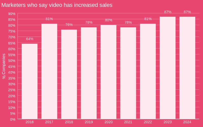
Visuals like images, videos, illustrations, animations, etc., are great landing page additions that can boost engagement. A Wyzowl survey reveals that videos have helped 82% of marketers increase the time visitors spend on their web pages.
In the same survey, 87% of marketers agreed that video had directly increased their sales.

Truthfully, high-quality visuals can make your landing page more attractive. You can use visuals to structure the flow of your landing page so that visitors have a better experience.
Check out how Hemsley uses visuals to break their web copy into digestible chunks in the example below:

The right visuals can also evoke emotions that prompt your target audience to take action. For instance, you can share a video about what inspired your course creation. Or one where you talk about the course in detail.
Like Brian Tracy, you can share an introductory video that aligns with your course topic. Doing this allows you to add a personal touch to your page.

Your video can give prospects a sneak peek into your communication style. This can help them see how relatable and engaging your course content would be. Also, it makes sense that people develop a sense of trust when they see you talking about your course in a video.
If you’re not big on recording videos, adding a portrait like Laura Best below is also a nice way to let potential customers “see” you:

Consider using a variety of visual content on your course landing page. Infographics and charts, for instance, can help showcase valuable insights related to your course.
That said, ensure your page has a neat layout so the visuals don’t look chaotic. Also, consider using alt tags for your content.
Thankfully, we’ve got some beautiful landing page templates that you can use. These templates should considerably reduce the time spent creating high-converting course landing pages.
5. Highlight social proof
Social proof plays on the idea that people are more likely to trust and adopt something if they see others doing the same, especially if it is beneficial.
Highlighting positive experiences from your previous students can increase the likelihood of conversions from prospective students. A survey by Bright Local reveals that 75% of consumers feel positive when they see reviews that describe a good experience.
You can feature written and video testimonials from past students who benefited from your course. That’s what Laura Best does on her course landing page. See the example below:

Another cool idea is to embed social media posts with positive reviews about your course. See how Technical Writer HQ does this below:

If you want something more in-depth, try doing a detailed case study on the journey of specific students (or clients for corporate courses). Capture details about where they were before taking the course and the growth they experienced after.
6. Create a clear call-to-action (CTA)
After combining a compelling headline with persuasive copy and engaging visuals, you need a clear call to action to convert visitors into buyers.
Call-to-actions should be straightforward and actionable. Tell website visitors what you want them to do next, such as “Join the waitlist,” “Register now,” “Enroll now,” etc.
You can also add an incentive to the CTA. Here’s an example from Datacamp’s course landing page where the CTA mentions that learners can start for free:

Make sure that your CTA button is visually appealing. Let it stand out with contrasting colors on your landing page. Also, the button should be placed where visitors can easily see it.
Strategic places for your CTA button include the top, middle, and bottom sections of your landing page. Yes, it’s okay to have it in multiple places.
You don’t know at what point on your page the potential student might get convinced. So, visitors shouldn’t have to scroll all the way up or down when they decide to take your online course.
Finally, only use one call to action on your landing page to avoid confusing your leads.
7. Offer a compelling incentive
A well-chosen incentive allows you to make your course more attractive to potential students. This can boost your online course sales significantly.
Incentives can be targeted to address specific concerns that potential students have. For instance, some might be interested in the course but unable to afford it. A nice early bird discount would be helpful in that case. This discount is also effective if you want to boost your initial sales rate.
You can even run a limited-time discount for a bit of urgency to get faster responses. See how Reliablesoft offers a whopping 80% discount on their online course:

Did you also notice the countdown timer above the page?

Other incentives you can offer include a free guide, template, or additional resources to help students dive deeper into the course. Data Camp, for example, provides a free course chapter, another effective way to lure in potential students.

If you have the time, you can also offer one-on-one mentorship or coaching for a couple of months. It all depends on what resonates best with your intending learners and what’s convenient for you to give.
Also, consider stacking multiple incentives just to offer more “extra” benefits. The goal is to make the value proposition too good to ignore. For example, you can pair an early bird discount with a bonus module. Incentives like this can quickly appeal to visitors and inspire action.
8. Optimize for mobile devices
Here’s one primary reason why optimizing the landing page for courses you offer is essential: a significant amount of web traffic comes from mobile devices.
Over 90% of internet surfers use mobile devices. If your landing page is not mobile-friendly, you risk losing out on mobile traffic that could potentially lead to sales.
To optimize your course landing page, use a responsive design that automatically adjusts to the screen size. This ensures all elements are correctly displayed and easy to interact with on mobile devices. See this example of Robin Kermode’s landing page:

Also, remember to avoid using overly large image files so the page loads fast. You can compress images using free tools like TinyPNG.
For videos, it’s better to host them on a platform like YouTube and embed them on your page instead of directly uploading the video to the landing page. This allows the video to load faster.
Finally, avoid using lengthy blocks of text so that the page is scannable on mobile devices.
9. A/B test elements
An A/B test comes in handy when you have various ideas for your landing page—how it looks, the call to action used, colors, page copy, etc.
With an A/B test, you create two slightly different versions of your landing page (Variant A and B). The versions might differ in one specific element, such as the CTA, Headline, or image used.

For instance, if you’re testing the call to action. You can try placing them in different positions on each page, using a different prompt or color. When visitors land on your page, they’re randomly assigned to see either Variant A or B. This allows you to get unbiased data.
After running the test for a predetermined period (the popular recommendation for significant results is at least two weeks), analyze the data to see which versions had a higher conversion rate. Of course, that’s the version to use for your course marketing campaign.
While it might be tempting to test multiple elements simultaneously, focusing on one at a time is the best practice. This is how you can get clearer results or determine what contributed to your page conversions.
10. Track and analyze performance
The final step is to test and analyze the performance of your course landing page. Your aim is to collect data that helps you understand how visitors interact with your page. You’re looking out for what you can improve on.
Use tools like Google Analytics to get proper data about your course landing page. Focus on metrics like:
- Traffic sources: where visitors are coming from. Organic search? Social media? Or paid ads?
- Bounce rate: High bounce rates could be due to slow load speed, poor copy, or ineffective CTAs, amongst others.
- Conversion rate: the percentage of visitors who complete your desired action—e.g., buy your course, enroll, or join your waitlist. Low conversion rates indicate that there are some areas for improvement. So, you need to investigate further to spot what the issue is.
Use heatmap tools like Mouseflow or Hotjar to determine areas of your landing page that have more activity. For instance, where site visitors click or scroll the most on your page.
Analyzing your course sales pages doesn’t just help you with data for improvement. It also provides valuable information that you can use to create future campaigns for other course pages.
3 stellar course landing page designs for inspiration
Before we conclude, let’s review some more course landing page examples that are worthy of emulation:
1. GetResponse Landing Page Course
The web page for our landing page optimization course features colorful graphics that are easy on the eyes. We start with a straightforward copy that tells visitors what the course offers, followed by a clear CTA.

We also featured an engaging video with Peep Laja, the instructor, sharing insight about the course. Then, there’s a section that highlights what learners will find in the course. We did this so prospects can have clearer expectations before signing up.

In another course, Marketing Automation, we added a section listing all instructors to show students they’ll learn from experts.

We also provide a more detailed course outline, helping prospects understand exactly what they will learn and how each module builds on the previous one.
2. Ahrefs’ SEO Training Course
Ahref’s SEO training course landing page has a simple design. We like that the page aligns with Ahref’s branding. The headline is direct and sums up the course’s content.
We also like that they indicate how many lessons are included in the course and how long it takes.

Ahrefs also clearly indicates who the course is meant for and the specific things it’ll help learners achieve. There’s a detailed course breakdown, too.

The review section includes testimonials from previous learners. That’s for social proof.

Another major highlight is the fact that Ahrefs includes links to other courses they have to offer. You can do the same thing if you have various courses that could benefit your visitors.
3. CXL Technical Marketing
The top section of CXL’s landing page features a convincing copy highlighting what students will gain from the course.

CXL maximizes social proof by indicating brands they’ve worked with. Again, we see a strategic use of videos to make the landing page more impactful.

Further into the course landing page, you’ll find a detailed course module, reviews from previous participants, a well-crafted copy, and a clear call to action button.
Conclusion
An effective landing page is essential to getting significant sales for your online course. We’ve discussed some major tips to help you create a high-converting course landing page.
To recap, define your target audience, craft captivating headlines and subheadings, write persuasive copy, use visuals, and include clear CTAs.
Offering incentives can help motivate leads. Ensure your page is optimized for mobile devices, A/B test page elements to improve effectiveness and track performance frequently.
With these tips, you can go on to build top-performing landing pages for your online courses. Good luck!
