A well-crafted B2B landing page is a critical component of your online marketing strategy.
See, unlike B2C companies, B2B companies have longer sales cycles. That means potential clients typically need to conduct extensive research before committing, and dedicated landing pages are key information resources.
As such, when a potential B2B client lands on your page, they expect to find detailed product information to help them make an informed decision. This might tempt you to add any and all details to speed up the conversion process, but don’t do that! It will only overwhelm them, leading to higher bounce rates.
Instead, ensure your landing page provides the right information to engage visitors, but just enough to entice them to take action without overwhelming them. So, how do you achieve this delicate balance?
This guide will discuss key steps and share great B2B landing page examples to inspire your next design. Let’s get started!
What is a B2B landing page?
A B2B landing page is a web page specifically designed to convert website visitors into leads or customers.
The page is created for specific marketing campaigns. Simply put, it is where your potential customers “land” if they click on, say, a link in your social media post or email promoting your product or service offering.
The primary goal of a B2B landing page is encouraging visitors to take a specific action, like filling out a form, signing up for a webinar, requesting a demo, or downloading assets. You’ll often find that the landing page has a single CTA prominently placed throughout the page.
Also, unlike regular web pages that allow visitors to navigate around, B2B landing pages often have limited or no navigation links to prevent distractions. This makes it easier for the visitors to stay focused on taking the desired action.
5 Key steps to crafting a high-converting B2B landing page in 2025
Today’s clients expect personalized, relevant, and seamless experiences from the brands they interact with. Crafting a generic, cluttered, or “boring” landing page for your potential clients doesn’t cut it anymore.
Here are five steps to help you build a high-converting page that informs, engages, and converts potential clients into high-quality leads.
1. Define goals and target audience
Before you start designing or writing content for your B2B landing page, know exactly what you want to achieve. Are you looking to generate leads, promote a product, boost brand awareness, or encourage visitors to sign up for a webinar?
Once your goals are set, the next step is defining your target audience. Doing this will help you create a landing page that resonates with them. To identify who they are, consider key factors like the audience’s pain points or needs, industry, and specific roles.
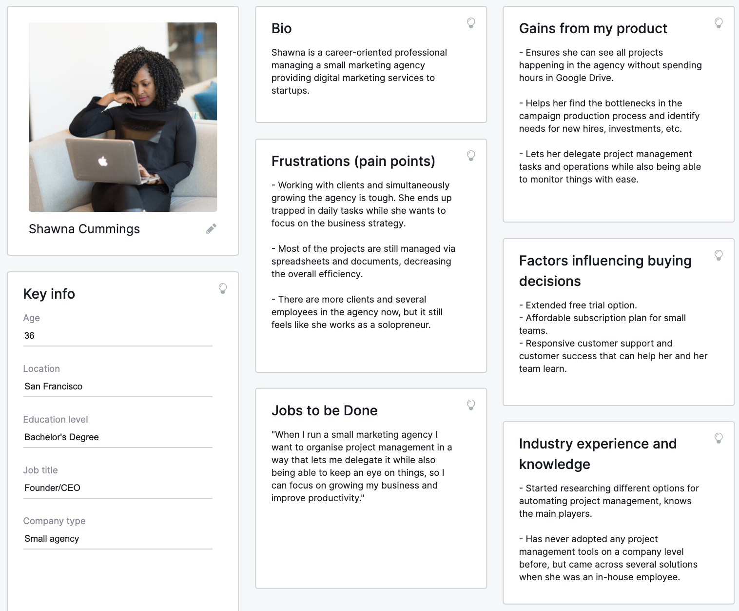
You can use this information to create a buyer persona that will help you visualize your ideal customer. Here’s an example.

With clear goals and a well-defined target audience, you can tailor the content and landing page design to meet your visitors’ specific needs.
For instance, if you’re speaking to CEOs or other busy executives keep your content concise and show exactly how your product offering contributes to their bottom line.
On the other hand, if you’re targeting technical professionals, you must include more detailed product specs.
2. Craft a compelling headline and subheadline
Your headline and subheadline are among the first things your landing page visitors will see. As such, they should be compelling enough to entice the visitors to explore further. So, how do you achieve this?
Make sure your headline is clear and concise. It should immediately convey what your offer is and why it’s valuable. The ideal length for a B2B landing page headline is 6–12 words.
Additionally, ensure your headline is relevant and aligned with your target audience’s needs. This will show them why your product or service is the answer to their pain points and needs from the word go.
While the headline captures attention, the subheadline provides more context or elaborates on the key benefits of your offering. If the headline promises a solution, your subheadline should explain how it works or why it’s particularly effective. We’ll show you how different brands approach this in the next section.
3. Design a clean and engaging layout
A well-designed B2B landing page can significantly enhance user experience and maximize conversions. And it all starts with a clean and engaging layout.
Avoid clutter and distractions—like unnecessary external links—that will overwhelm visitors and distract them from the main message or call-to-action (CTA). Instead, use ample whitespace, organized content blocks, and bullet points to create a visually appealing and easy-to-navigate layout.
To keep visitors engaged, incorporate interactive elements into your layout. You can include high-quality images, videos, or infographics that complement your content. Subtle animations, like hover effects on buttons or images, can also make your page feel more interactive and guide user actions without being distracting.
4. Include social proof and testimonials
In the B2B industry, purchasing decisions often involve multiple stakeholders and larger investments. Therefore, prospects need assurance that your offering is reliable and effective. Social proof plays a critical role in providing that reassurance. This makes the inclusion of social proof a critical B2B landing page best practice.
Some of the most effective types of social proof to incorporate include customer testimonials, case studies, client logos, industry awards, and user-generated content. Ensure they are prominently placed and relevant to your niche audience.
In addition, include the client’s full name, job title, company name, and a photo. This adds authenticity and helps potential clients connect with the testimonial on a more personal level.
5. Optimize for conversions and mobile
B2B landing pages are a critical point of contact in the customer journey. It’s where most of your marketing efforts end up. All the traffic from your paid campaigns, email, social media, and so on is sent to these landing pages in the hope that it will convert into leads or customers. Therefore, your investment in the other campaigns is pointless unless you’ve optimized your landing page for conversions.
To optimize for conversions, ensure your website is well-designed and easy to interact with. Use a clean design, prominently placed CTA buttons, and actionable language to encourage immediate action.
Also, ensure your page loads quickly to avoid frustrating visitors. You can compress images, use asynchronous loading for JavaScript, leverage browser caching, and use a content delivery network (CDN) to improve load times.
To optimize your B2B landing page for mobile devices, use a responsive design that automatically adjusts the layout and content based on the user’s screen size.
Besides that, use a single-column layout and make sure buttons and links are large enough and spaced out for easier navigation.
4 Best B2B Landing page examples to inspire your next design
Here are the best B2B landing page examples to inspire you:
1. GetResponse

Our Content Monetization landing page combines several vital elements that make it one of the best B2B landing page examples.
As soon as you land on the page, the first details you’ll notice are the headline, subheadline, and the video in the hero section. The headline is brief and direct but, telling you exactly what the page is about.

The subheadline plays the supporting role to the headline. It sheds more light on the specific offerings of our content monetization product, emphasizing the efficiency of doing it all on an all-in-one platform.
The video is also a brilliant move. The best part is it does not open to another tab, so visitors are not redirected to some other platform where they may get distracted.
Notice that we’ve placed a CTA above the fold in a conspicuous hard-to-miss color. We use the same CTA “Create Free account” throughout the landing page. This directs visitors towards a specific goal, making it easier for them to understand what action we want them to take. Plus, we emphasize that it’s “Free” in the CTA text itself.

The other thing you’ll notice is that our page is highly visual, which makes it engaging and the content more digestible. We use icons, images, and subtle animations like the hover effect on CTA buttons (which turn the buttons from yellow to blue), as shown below.

These interactive features enhance the user experience of what would have otherwise been a very text-heavy long-form landing page.
Speaking of better user experience, we have organized content into content blocks. We’ve kept each section brief using short sentences, and bullet lists where necessary.
You don’t have to block out time to read and understand what it’s all about—visitors can easily scan through the content as they go on with their day.

We are not above a little bit of boasting when it comes to what we get right. So, instead of the same old features list, we’ve presented our features in a comparative way that shows what we do better than our competition, and why we should be our visitors’ first choice.

We’ve backed these claims with customer reviews, too.

An FAQ section toward the end of the page allows us to address potential objections and provide additional valuable information about the product. This helps us move our visitors one step closer to taking the desired action–creating a free account.
Finally, you can tell that we remain consistent with our fonts, design, and color palettes throughout the landing page. This builds familiarity and credibility.
You can create such a landing page, with our landing page creator. We also offer over 200 customizable predesigned templates.
2. Monday.com

This Monday.com landing page is another great example you can emulate. First, you’ll notice they’ve forgotten the navigation bar, which is usually at the top of normal web pages. This reduces the chances that visitors will get distracted and wander to other pages before taking the desired action.
The headline is brief and intriguing. Anyone would want to know more about the new way of working together mentioned. The subheadline also does a great job of introducing Monday.com’s clear value proposition, which is the efficiency of comprehensive project management software.

Next, you’ll notice the bit outlining the company’s different offerings. They’ve made it interactive to engage the visitor. This is also connected to the CTA right below it, which changes colors depending on the products you choose.

The CTA is very visible and easily available at multiple points throughout the landing page.
We also like that the landing page incorporates lots of social proof. Notice the clients’ logos at the top of the page. This is a brilliant way to earn visitors’ trust as soon as they land on the page.

They’ve also included industry awards and recognitions in the middle and verified customer reviews towards the end of the landing page.

Like the GetResponse example above, Monday.com uses the comparative format to highlight its key features. Considering how competitive the project management tools landscape is, this is a great way to show potential clients why they should go with Monday.com.

They also use organized content blocks complemented with high-quality visuals like images and animated graphics.

The one thing that stands out the most on Monday.com’s landing page is how simple the design feels and looks.
While that might be because they’ve used a simple design, it can also be attributed to the ample white spaces they used. The white spaces ensure landing page visitors are not overwhelmed.
3. Bigin

Bigin’s landing page is a good landing page example with short and sweet headlines. Their subheadline is a bit longer compared to the other examples we’ve seen. But this is not necessarily a bad thing since they have made it more personal. They’ve also made an effort to tap into their target audience’s emotions.

Unlike the examples we’ve covered so far, Bigin has not hidden its signup form behind a CTA button. This straightforward approach ensures visitors are clear on the desired action from the word go. They’ve also streamlined the process by having only four fields on the lead generation form.

Bigin’s landing page does not have a navigational menu. However, when you scroll past the hero section, you’ll notice an anchor menu pops at the top.

This type of menu uses anchor links that users can click on to skip to specific sections within the landing page, enhancing the user experience.
Bigin also speaks to its target audience (small businesses) directly. For instance, this section focuses on what makes their CRM tool ideal for small businesses. They’ve tried to make it as relatable and personal as possible to ensure it resonates with small businesses.

Bigin also uses the comparison design format to highlight its platform’s key features.

However, they added a twist by including a comparative pricing section. This reinforces the idea that they are the better choice for small budget-sensitive businesses.

Bigin’s landing page also features social proof, which is paramount when designing a landing page for B2B businesses. They start with rating scores from top review platforms:

They also have authentic customer testimonials from satisfied clients.

Despite the detailed feedback, you can tell that these testimonials are genuine because Bigin has included the clients’ names, titles, company name, and a photo.
4. Hootsuite

One recurring theme you’ll notice from most landing pages we’ve featured is the absence of a navigation bar. This landing page from Hootsuite has done the same thing.
As we mentioned earlier, removing the nav bar can be a great way to keep landing page visitors focused on the page, which can lead to more conversions.
Besides that, you’ll notice the landing page has no subheadline. However, the headline in this case seems enough. It communicates the value of the platform very clearly.
Right beneath the headline is a visible CTA, “Start your free 30-day trial”. This same CTA is used throughout the page.
They’ve also used the hover effect on the CTA, making it more interactive.

This B2B landing page design uses partner logos from big companies as social proof. Including the estimated number of clients makes the brand reputation even more impressive.

You’ll also notice that their design is highly visual. There are lots of images and icons. These have made the landing page more interactive and the content more digestible.

Besides that, Hootsuite has broken down its text into brief and concise content blocks. They are either one sentence or two at the maximum. They’ve also used the drop-down feature, color, font sizes, white spaces, and subheadings to create a visual hierarchy that makes it easy for visitors to navigate the landing page.

Hootsuite does not have a dedicated comparison section, which is a trend in most B2B landing page examples. However, they’ve included a “Why Hootsuite?” section at the end. The section shows how and why the social media marketing tool stands out against its competition.

The landing page ends with a featured review to convince visitors still sitting on the fence.
Conclusion
Building a high-converting B2B landing page is essential for any business looking to capture and convert leads effectively.
A successful B2B landing page starts with deeply understanding your goals and target audience. These factors will determine how you present every other element on your landing page.
Once you’ve identified them, craft a compelling headline and a subheadline, design a clean layout, and incorporate social proof to build credibility. Additionally, optimize for conversions and mobile compatibility to enhance user experience and maximize your landing page’s effectiveness.
Don’t forget to draw inspiration from the successful B2B landing page examples we’ve shared above.
Over to you. Check out the extensive GetResponse landing page template library if you need help creating an effective landing page.
